
- LACMA | Design System
- Verkada | Presentation
- NorthBurl | Design System
- Apple | Presentation
- Chess.com | Visual Design
-
Avisi Tech | Design System
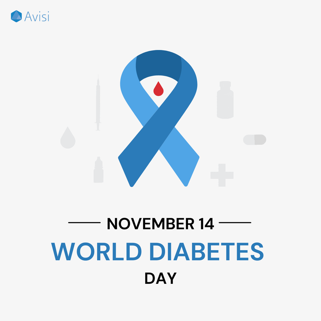
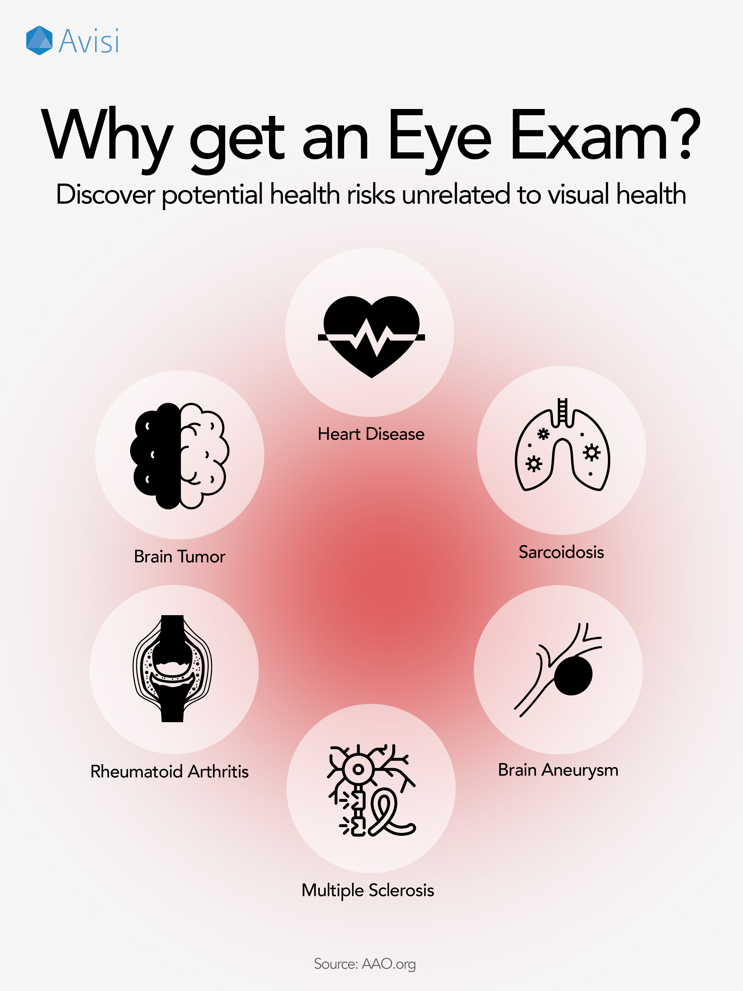
- Avisi Tech | Social
- EVEXIAS Health | Print
- UCLA | User Interface
-
826LA | Design System
- Video | Production
- Fabrication | Fun
- Creative Code | Fun
- Mural | Fun
Resume
About
︎ ︎
Avisi Technologies
Avisi is a medical device company treating glaucoma, a disease that can cause permanent blindness. To strengthen brand consistency, I created a comprehensive Branding Guideline Book and cohesive visual assets for LinkedIn and investor communications, resulting in a 75% improvement in brand cohesion and a 40% increase in audience retention.
Presentation Designer
Marketing Manager, CEO
Content Creator
Engineering
Urna Bajracharya
Rui Jing Jiang
Seth Harrington
Shaelynn Fisher
Rui Jing Jiang
Seth Harrington
Shaelynn Fisher


Branding Avisi’s was an honor because of how much the company is growing. It was my first time designing for FDA compliance and I learned a lot about how design and presentation can have a big impact in the apporval of a product.I can’t wait to see how Avisi takes the glaucoma device market by storm!
Deep Dive
Avisi Tech
Avisi Tech
Brand Establishment. After conducting an in-depth analysis of competitors within the glaucoma device industry, I observed minimal art involved in the older brands and a modern abstraction in the newer ones. I pitched using a cohesive, minimalist color palette which has now been adopted. This deliberate approach positioned the brand as sleek, modern, and distinctively innovative.
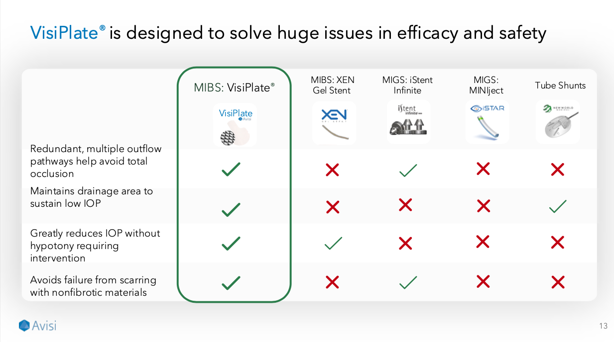
Pitch Deck Redesign. A key goal of the pitch deck redesign was to enhance visual clarity, specifically accommodating users with visual impairments. I accomplished this through careful implementation of high-contrast typography and strategic drop shadows, greatly improving readability and accessibility. Additionally, I paid meticulous attention to ensuring the slide headers and footers remained clean and uncluttered, providing a polished foundation for the content.
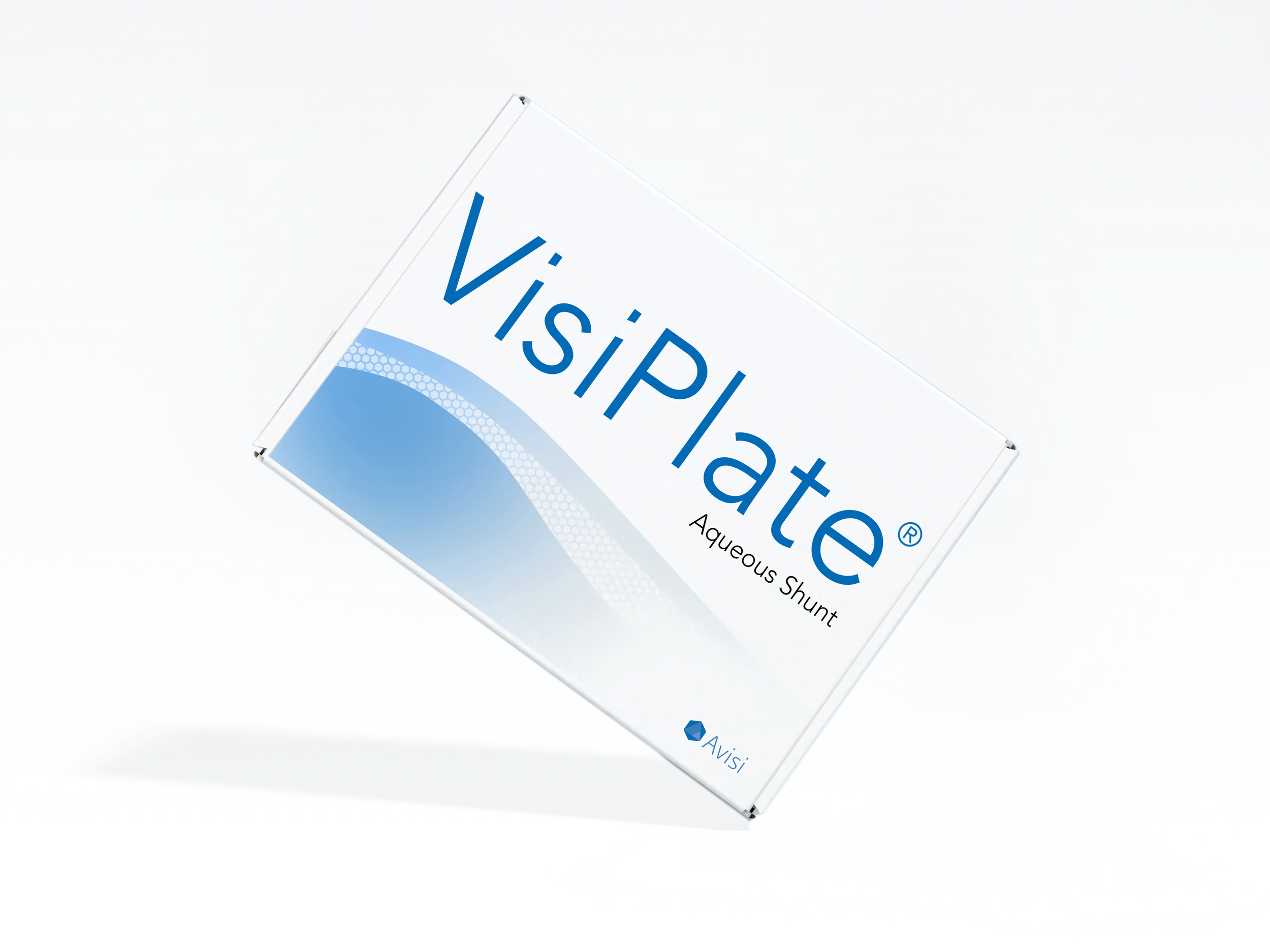
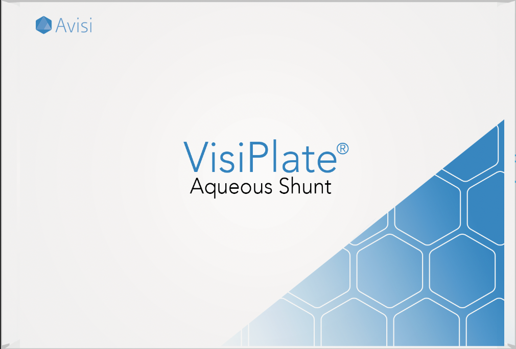
VisiPlate Visual Packaging Concept. For the pitch deck’s core visuals, I explored metaphoric representations of aqueous fluid movement, emphasizing the function of the Visiplate device in treating glaucoma. After iterative exploration, I developed a dynamic blue-gray gradient paired with a hexagonal graphic representation of Visiplate, softly dissipating toward the periphery to symbolize fluid flow. Lastly, the oversized typography for “VisiPlate” created a bold and striking visual presence unprecedented within the glaucoma industry, significantly amplifying brand memorability and market differentiation.
Competitors

Early Draft

Final Draft

