
- LACMA | Design System
- Verkada | Presentation
- NorthBurl | Design System
- Apple | Presentation
- Chess.com | Visual Design
-
Avisi Tech | Design System
- Avisi Tech | Social
- EVEXIAS Health | Print
- UCLA | User Interface
-
826LA | Design System
- Video | Production
- Fabrication | Fun
- Creative Code | Fun
- Mural | Fun
Resume
About
︎ ︎
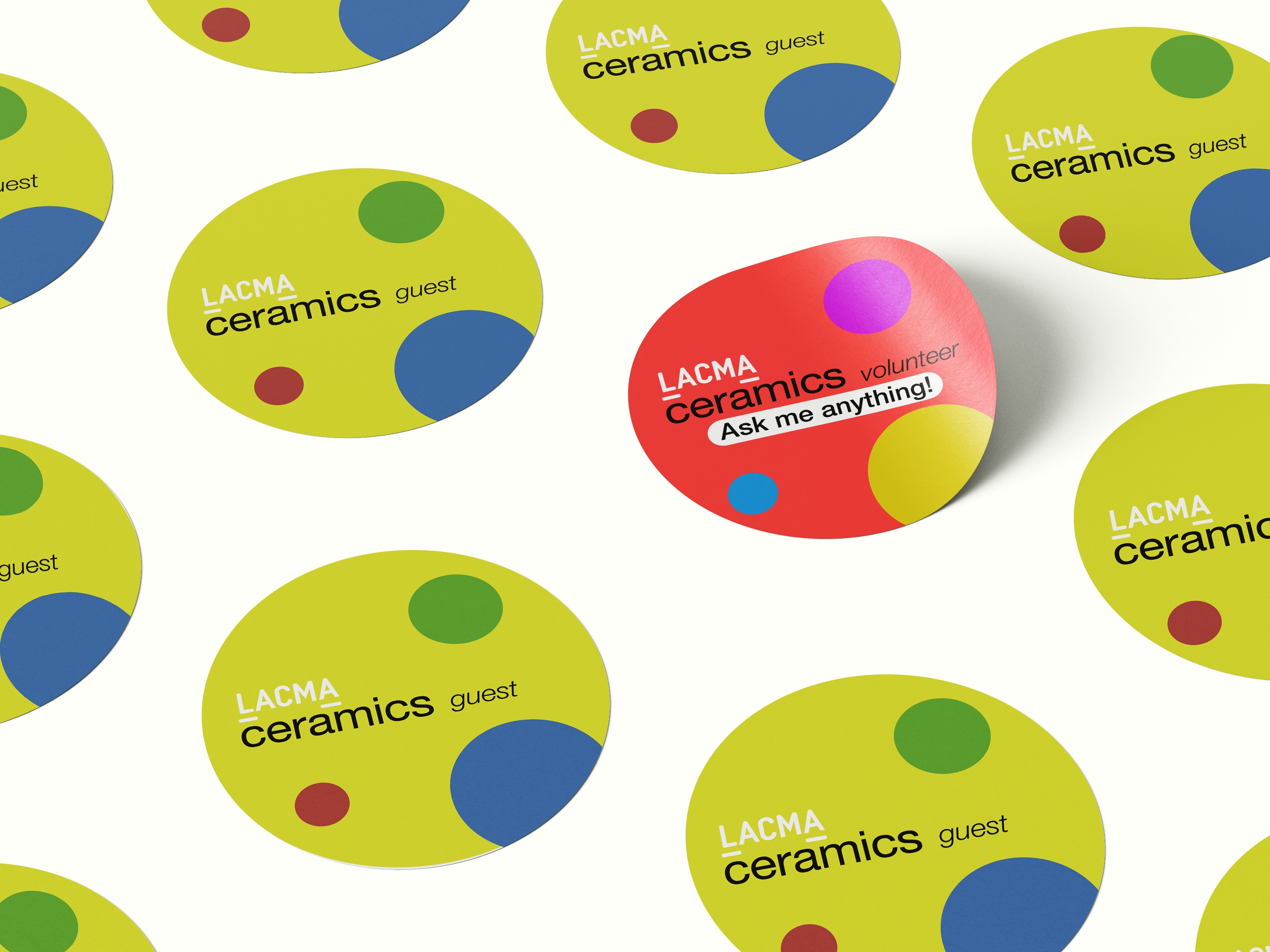
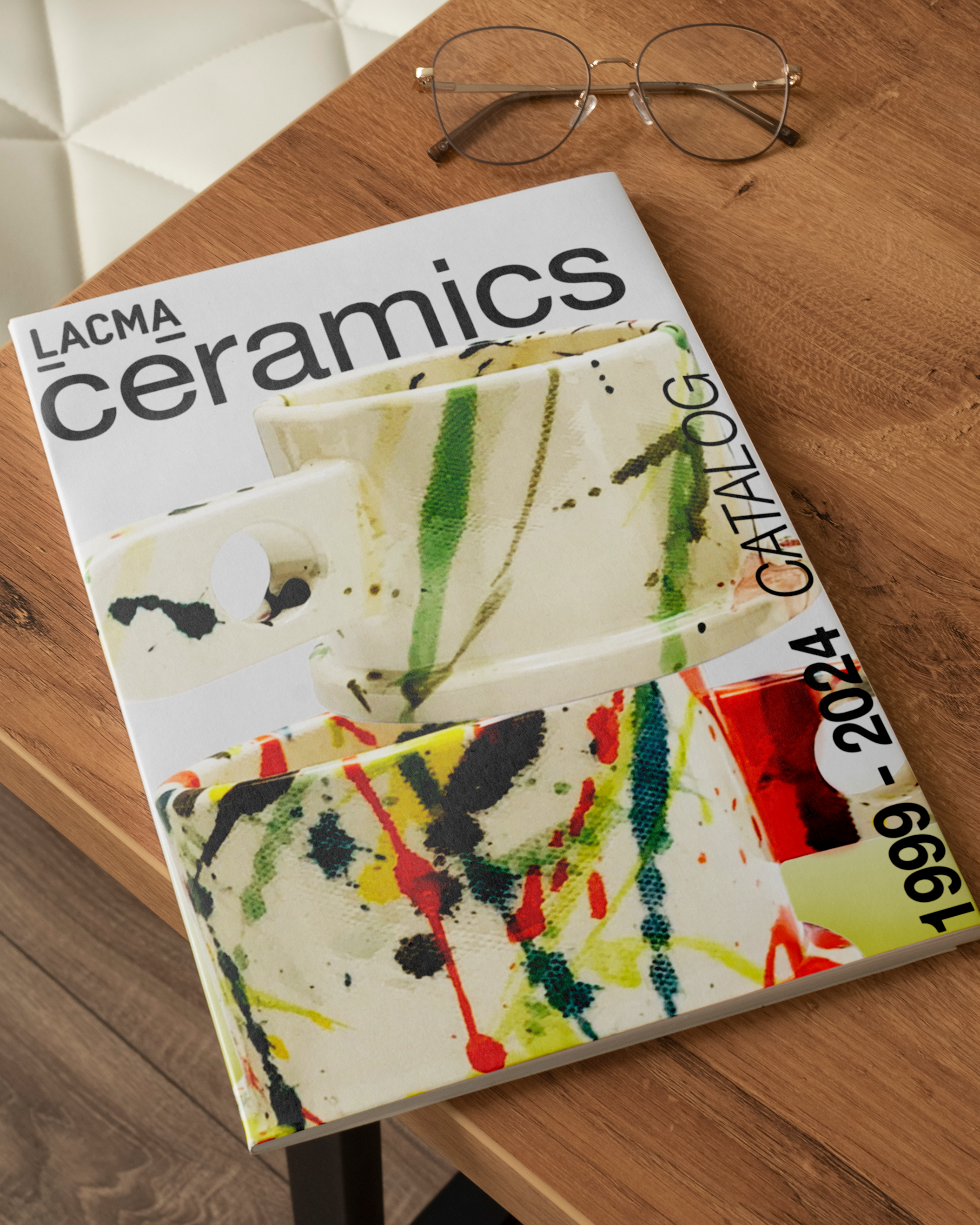
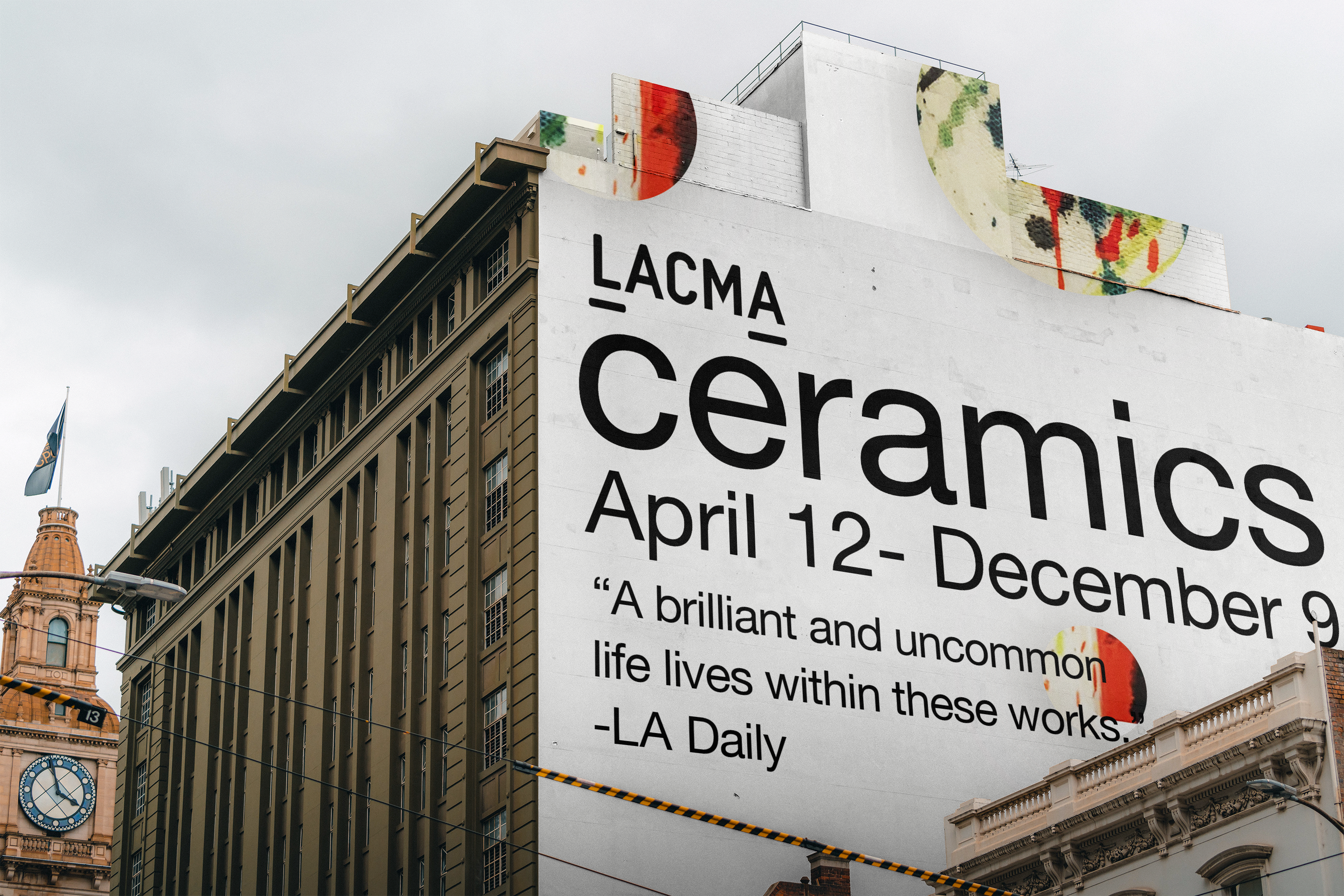
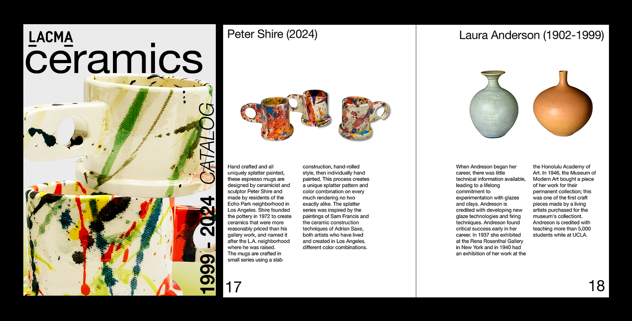
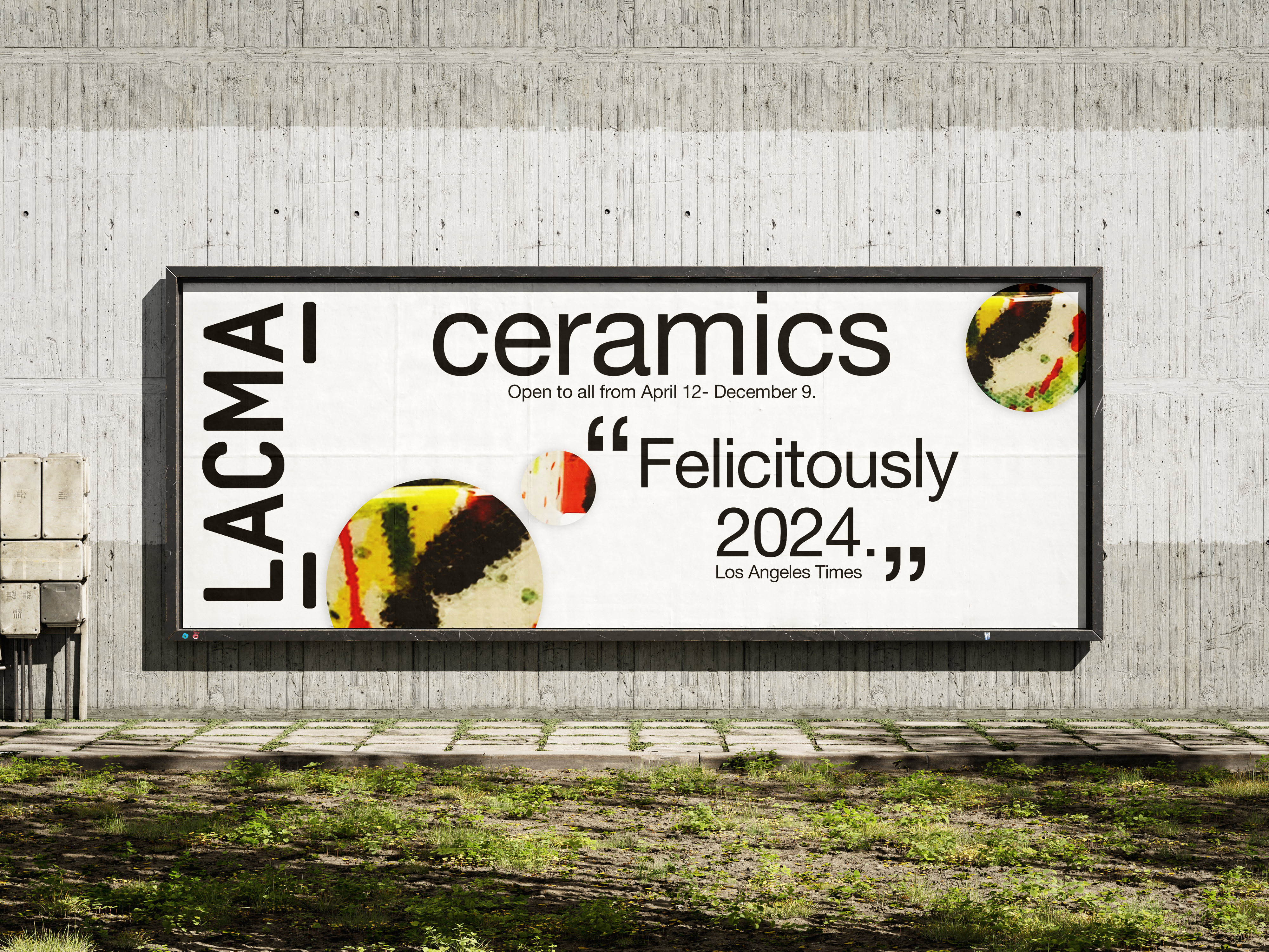
LACMA
LACMA's Ceramics catalog and advertisement design were made for the moment, a celebration of the ceramics department at LACMA. The design was based on Peter Shire's avant-garde cups. Marketing collateral such as stickers and billboards used circle "frames" in Shire's cups.