- LACMA | Design System
- Verkada | Presentation
- NorthBurl | Design System
- Apple | Presentation
- Chess.com | Visual Design
-
Avisi Tech | Design System
- Avisi Tech | Social
- EVEXIAS Health | Print
- UCLA | User Interface
-
826LA | Design System
- Video | Production
- Fabrication | Fun
- Creative Code | Fun
- Mural | Fun
Resume
About
︎ ︎
LACMA
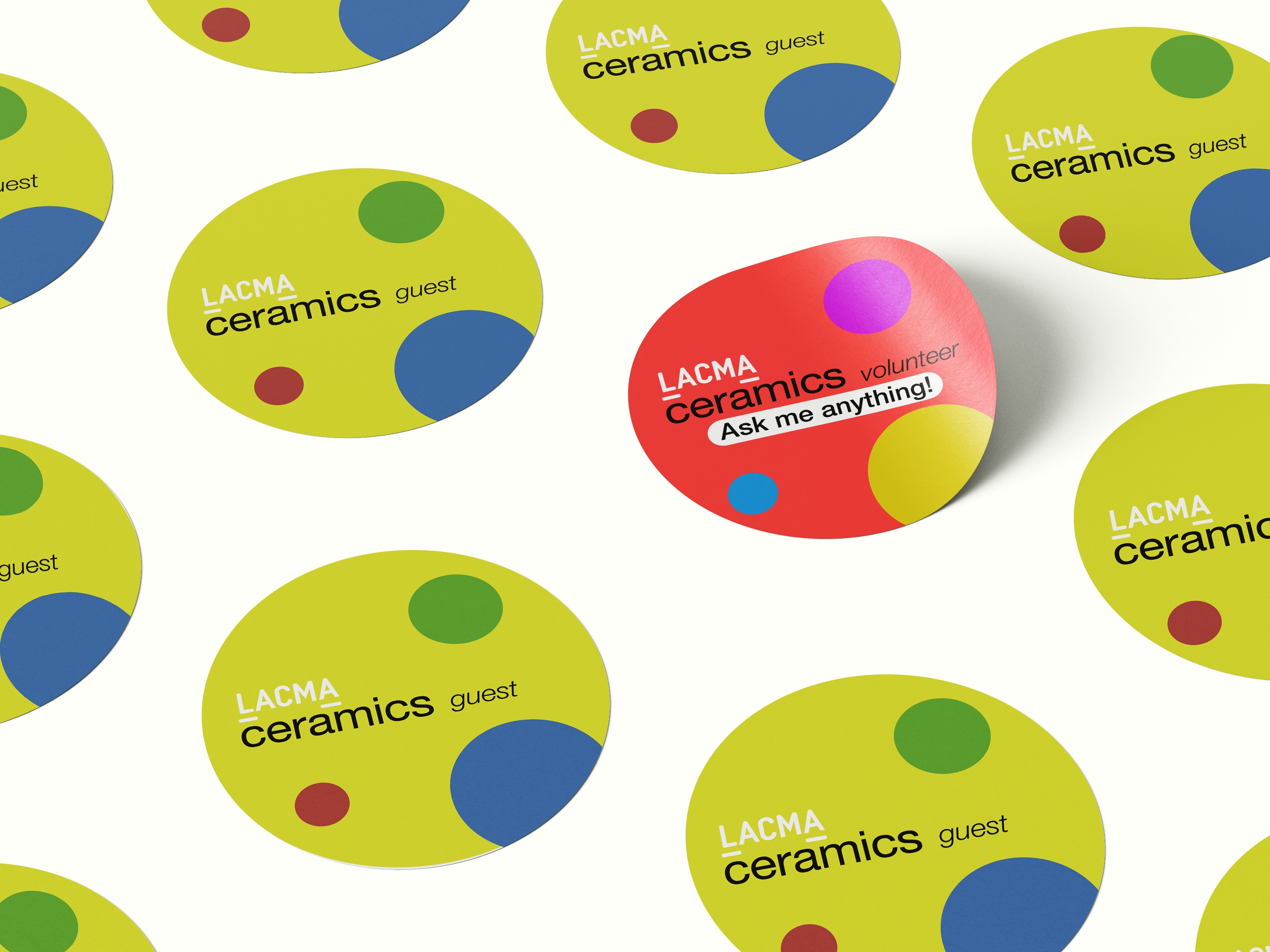
LACMA's Ceramics catalog and advertisement design were made for the moment, a celebration of the ceramics department at LACMA. The design was based on Peter Shire's avant-garde cups. Marketing collateral such as stickers and billboards used circle "frames" in Shire's cups.
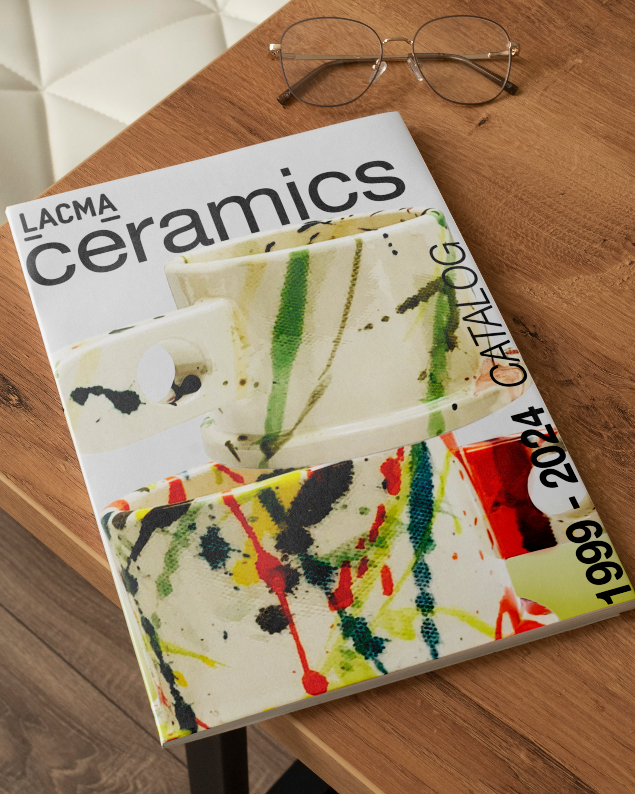
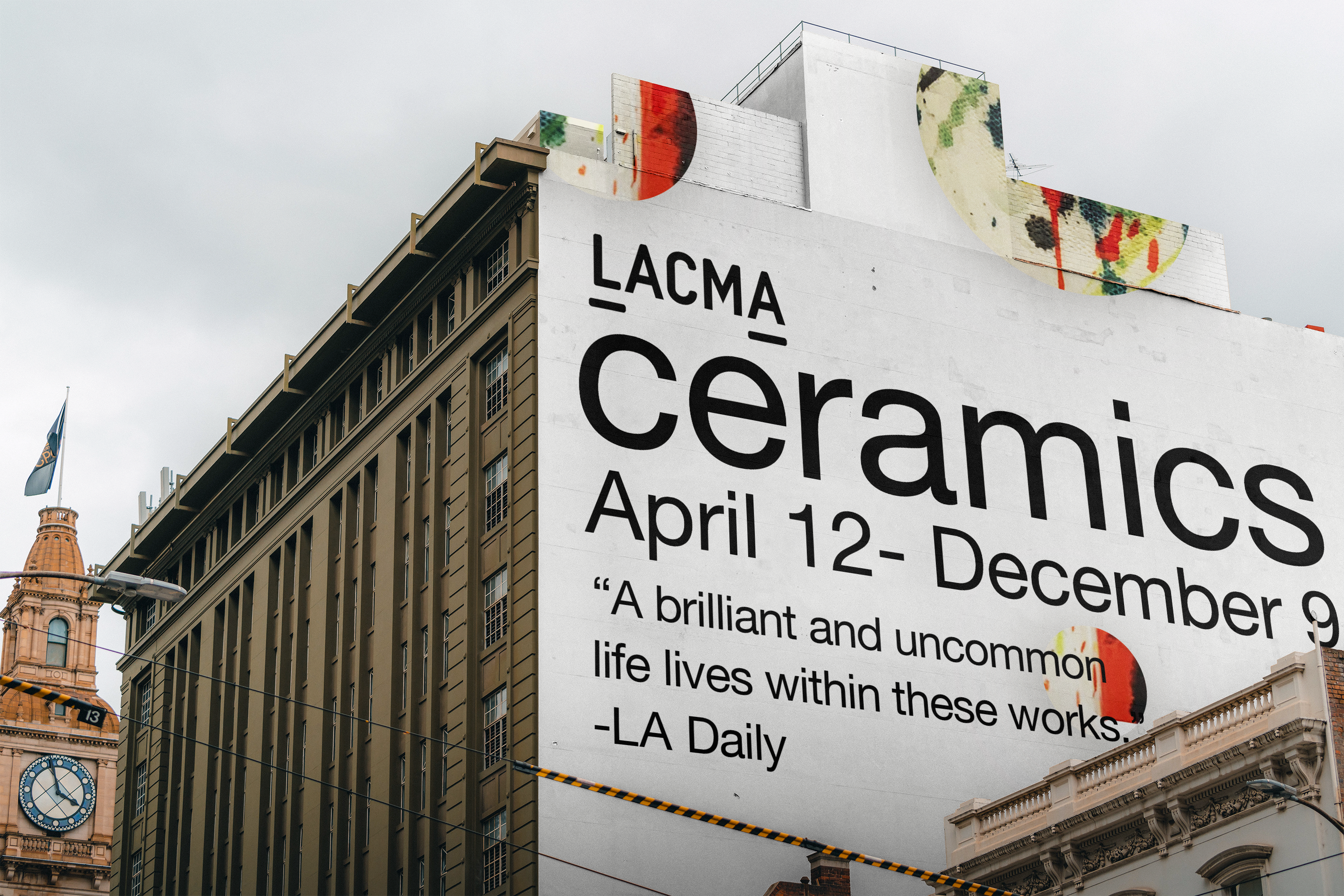
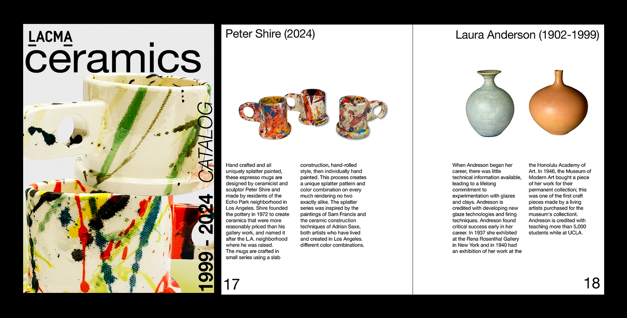
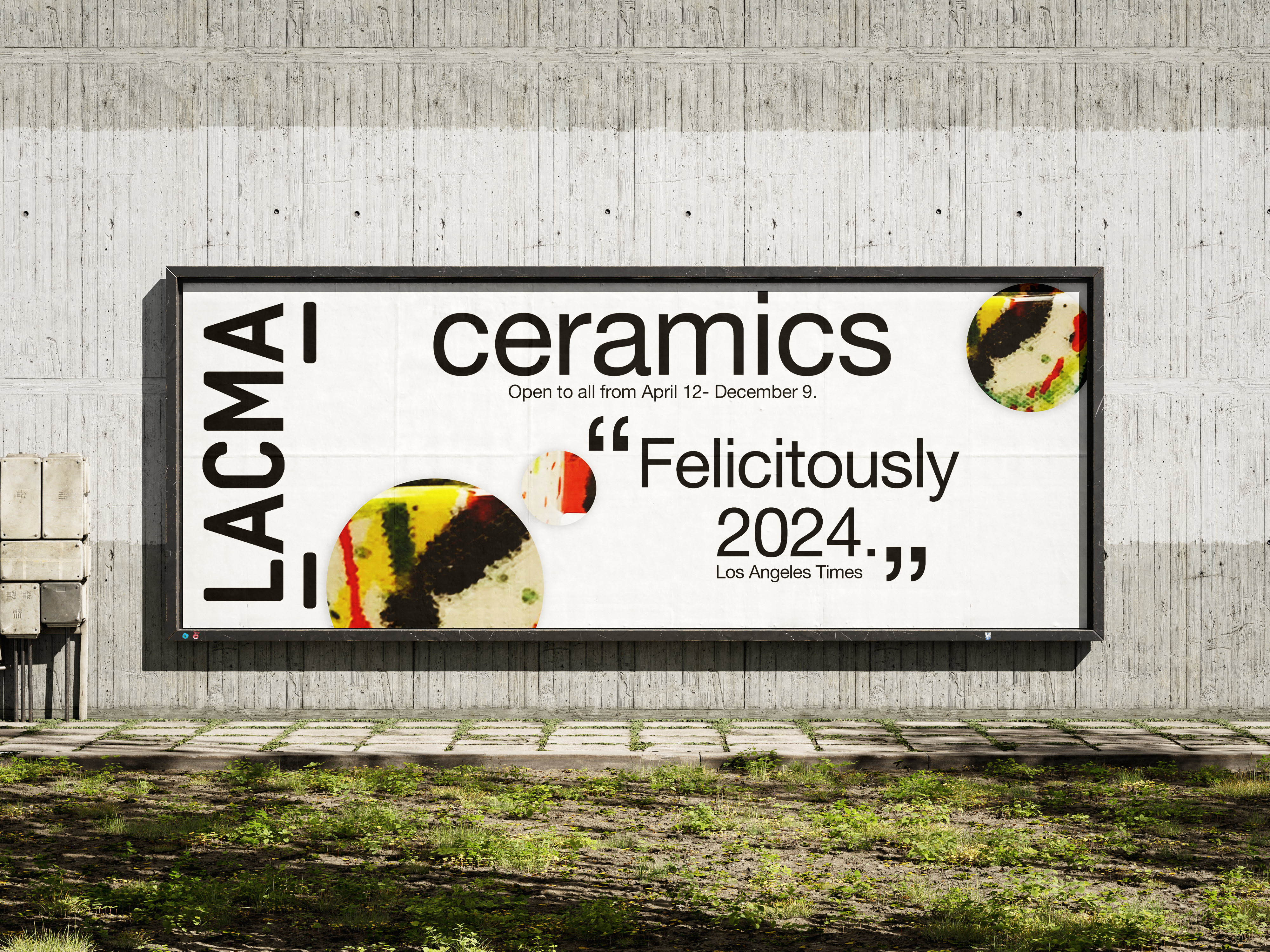
The story for LACMA’s exhibition thrives in and out of the public canvas. Working on this helped me see how publicadvertisements can be a place to showcase and a precious moment to teach. Thank you to the marketing team for the opportunity!
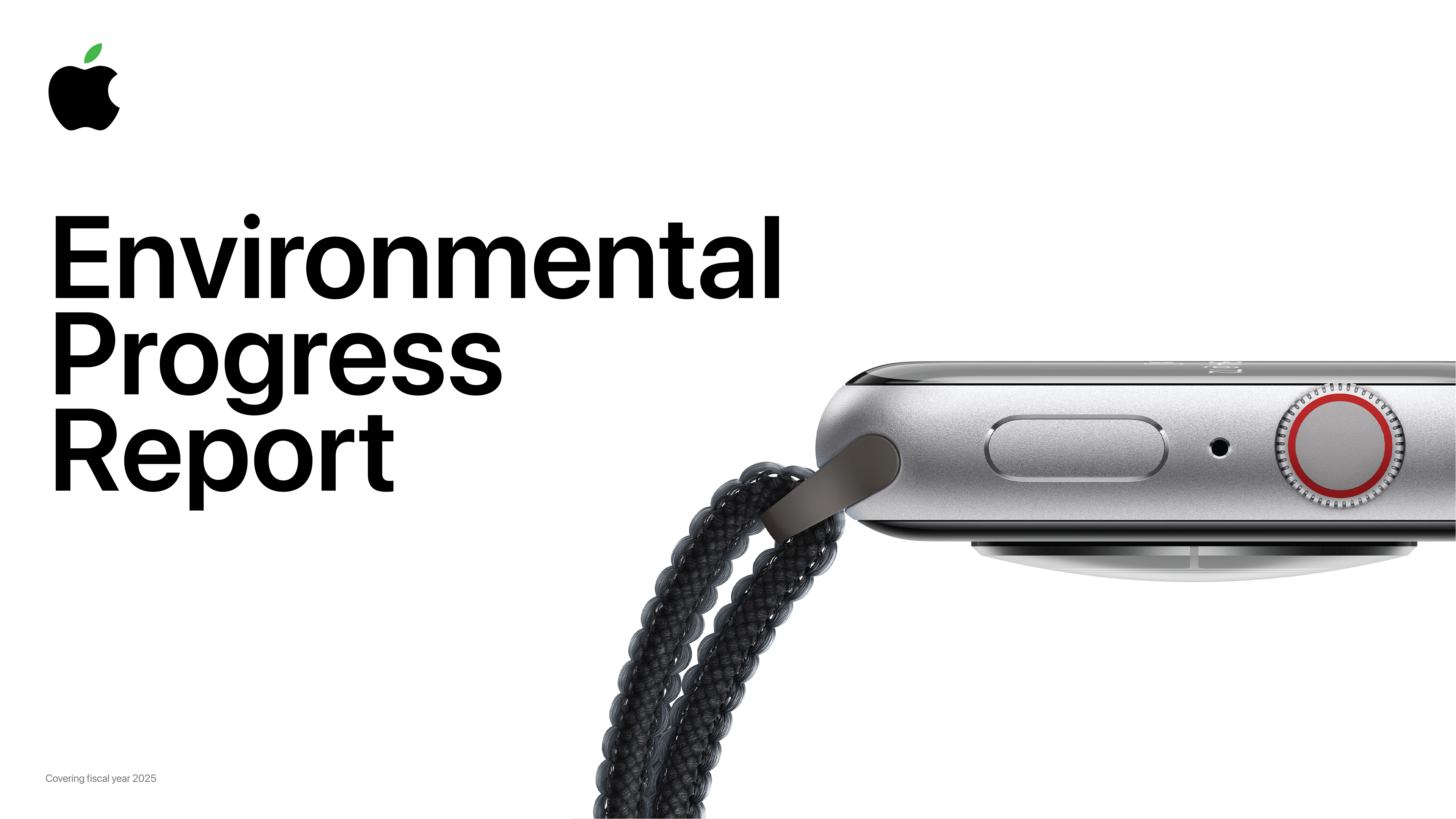
Apple
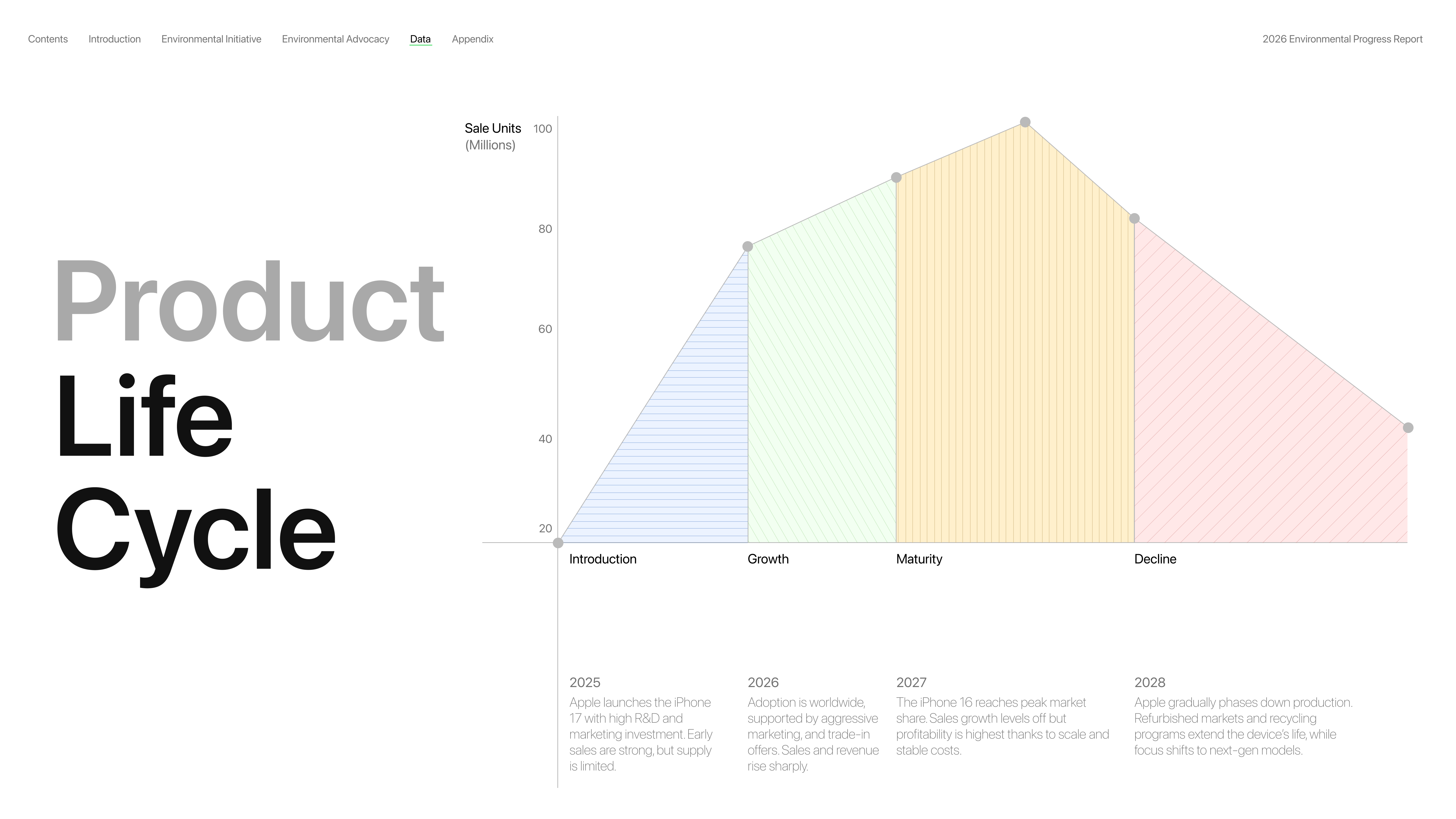
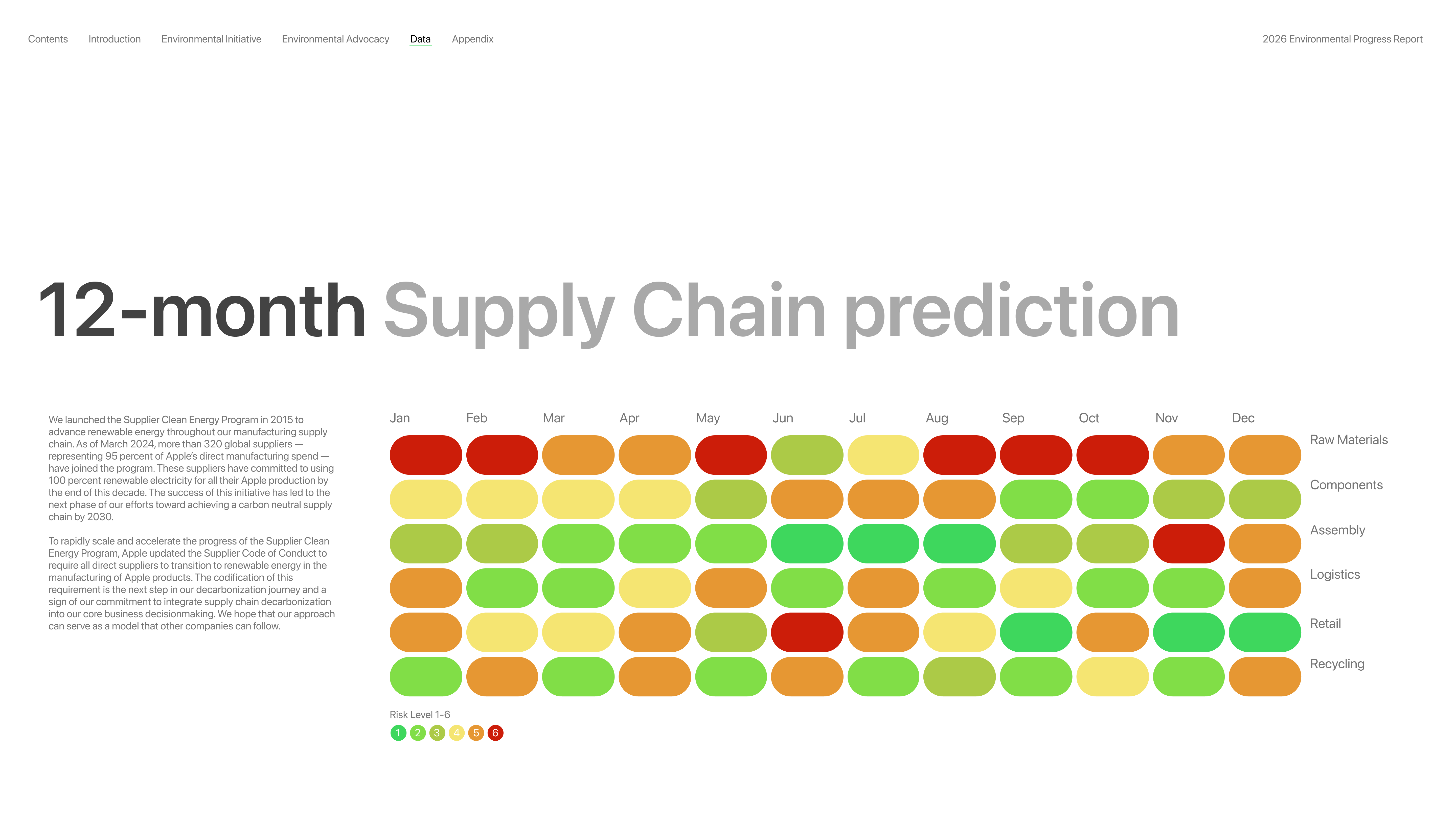
This project demonstrates my ability to translate complex business operations into clear, compelling visuals. Using Apple’s iPhone 16 as a case study, I built a mock supply chain model and a product life cycle (PLC) chart to illustrate how global production, risk factors, and market dynamics can be represented in data-driven design.
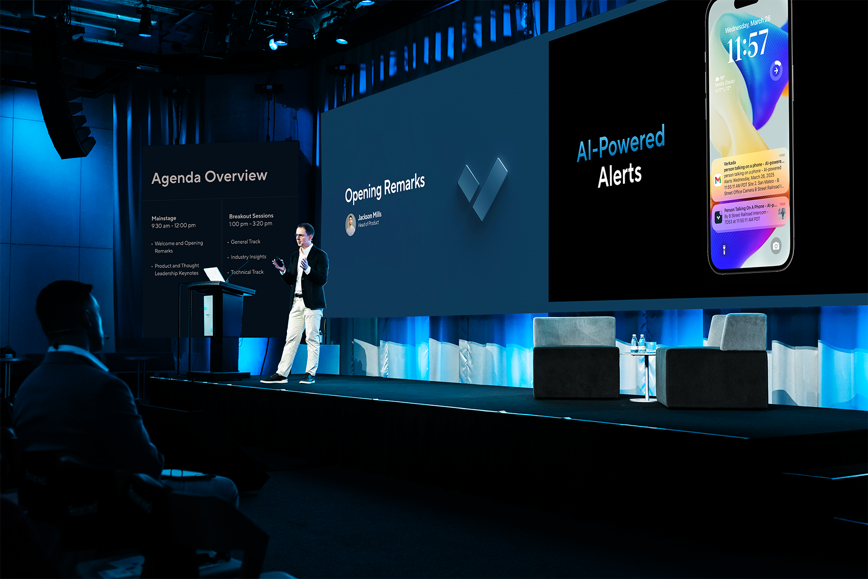
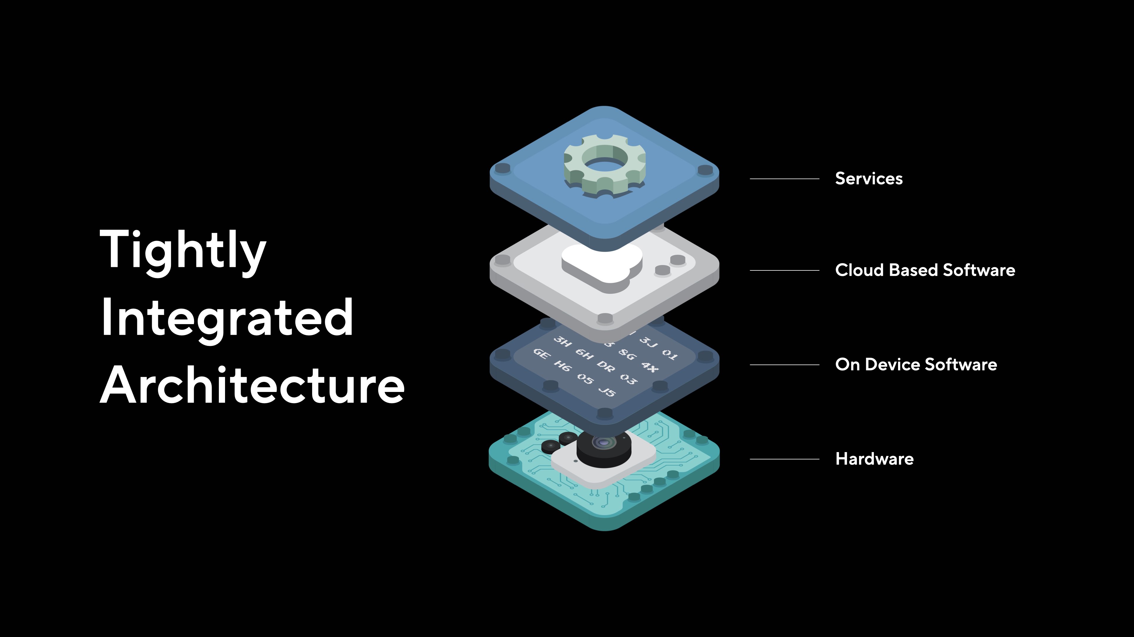
Verkada
Verkada, a cloud based physical security company that makes high-end security cameras for enterprise level organizations valued at $5 billion.
As a Presentation Designer I came up with internal and external technical deck content designs that were original to the company branding and solved needs of industry specific communications to audiences in Australia, Europe, and USA.
Presentation Designer
CEO
Creative Directors
Urna Bajracharya
Filip Kaliszan
Jowl Bowers, Bo Deng
Filip Kaliszan
Jowl Bowers, Bo Deng


VerkadaOne 2025
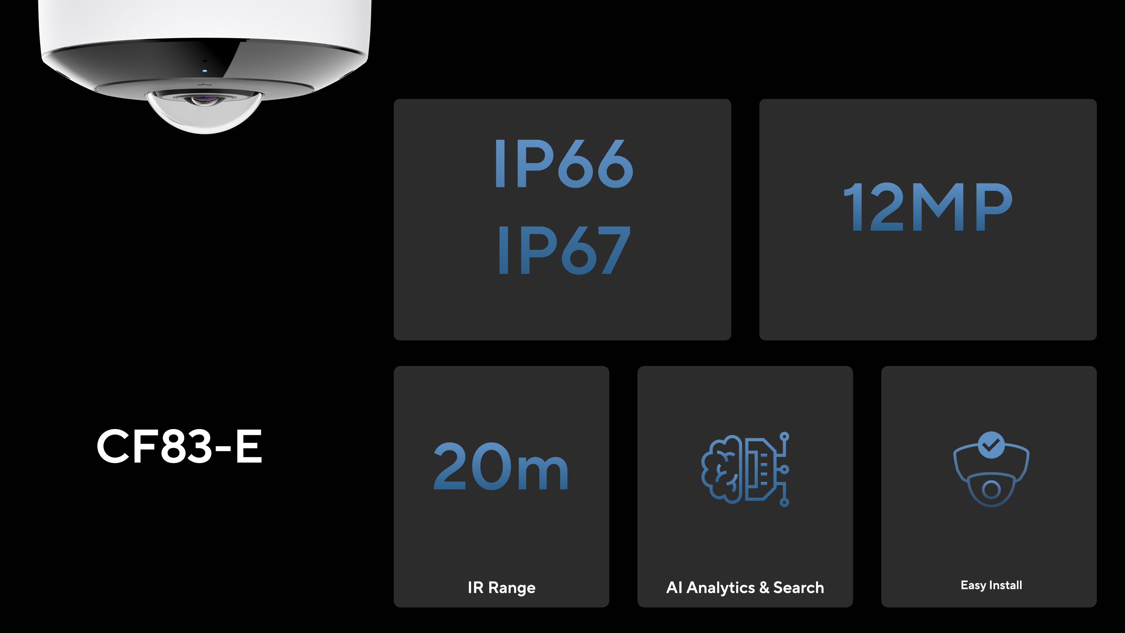
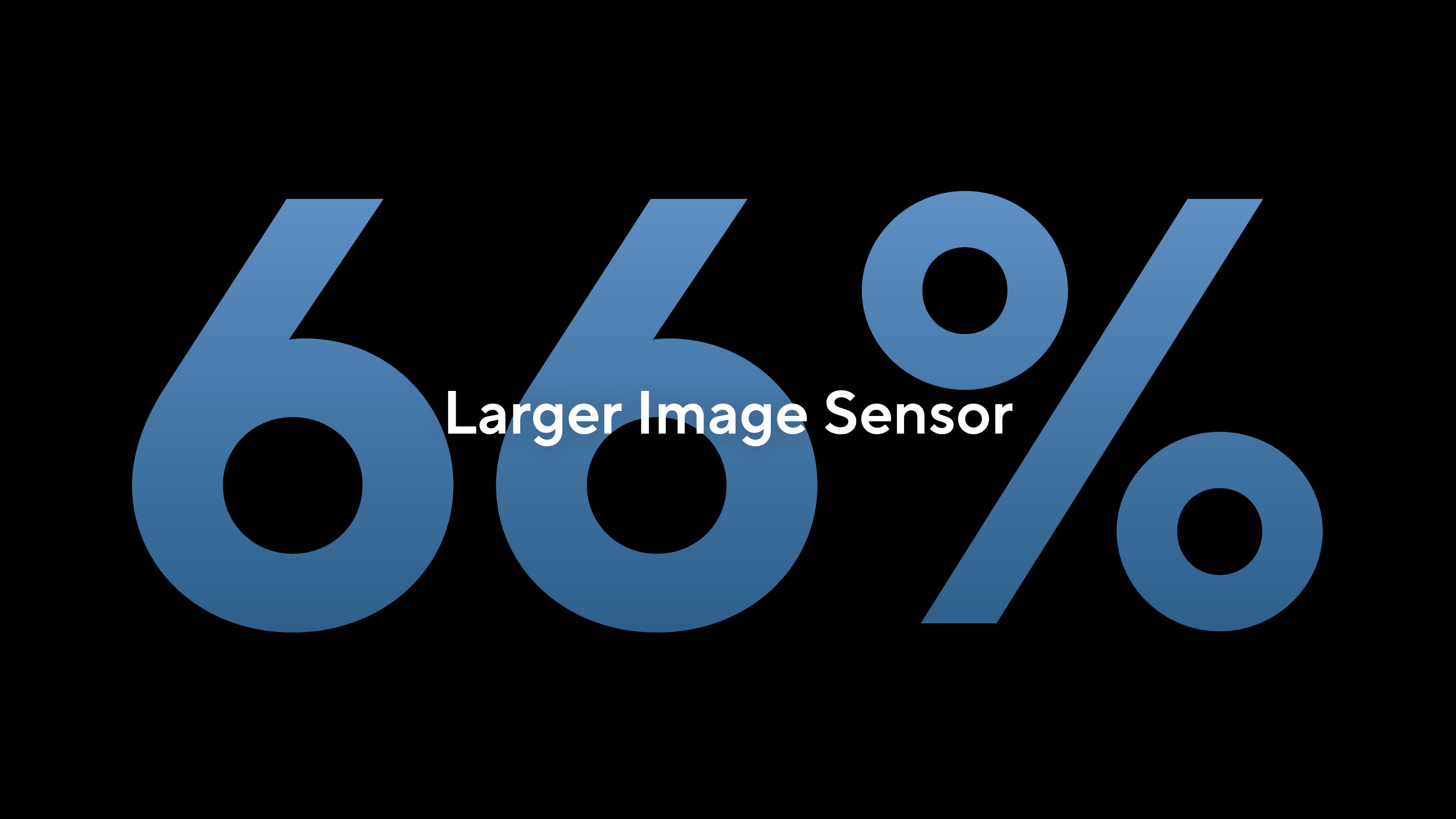
Techincal Illustrations of camera sensors


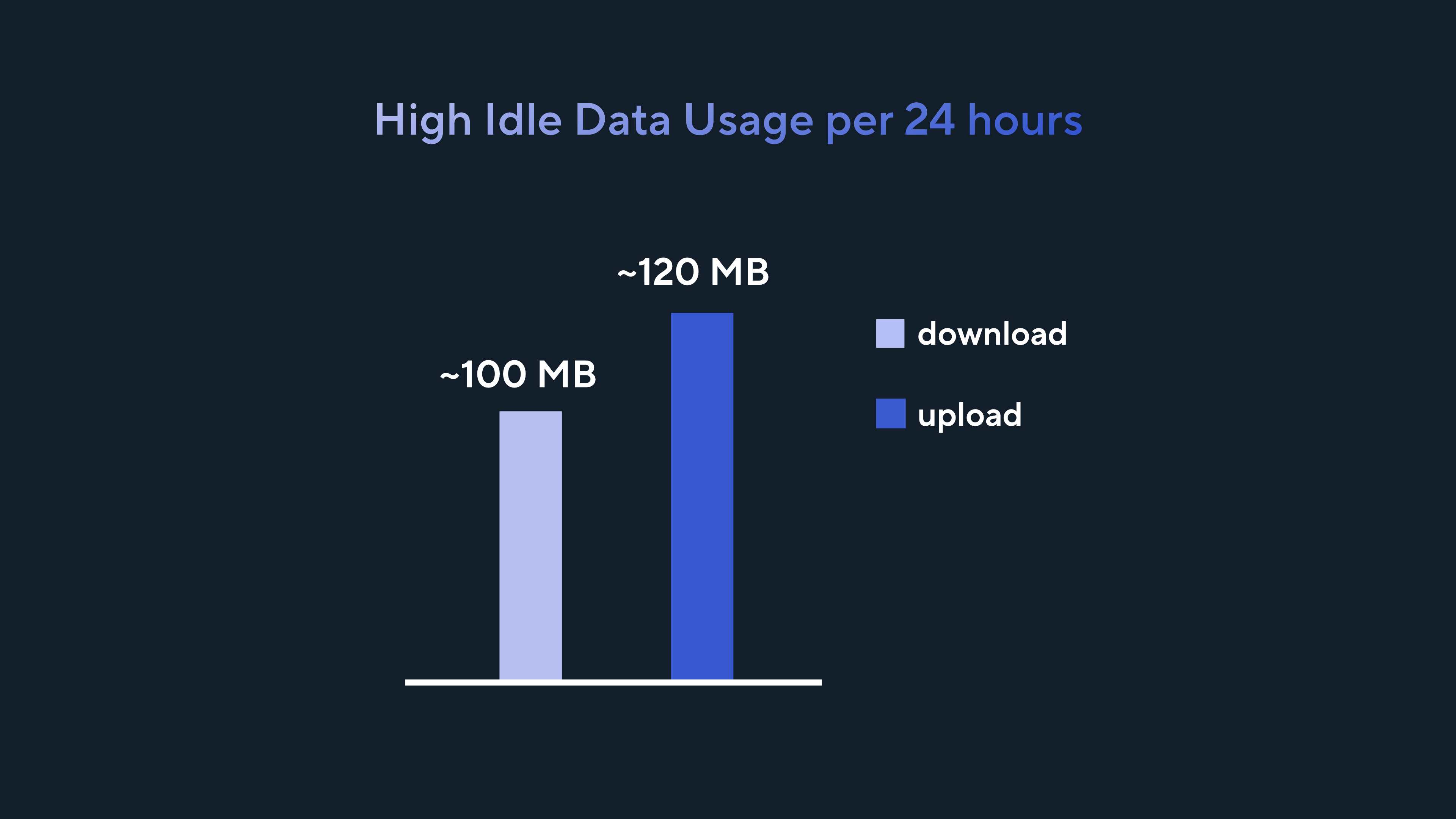

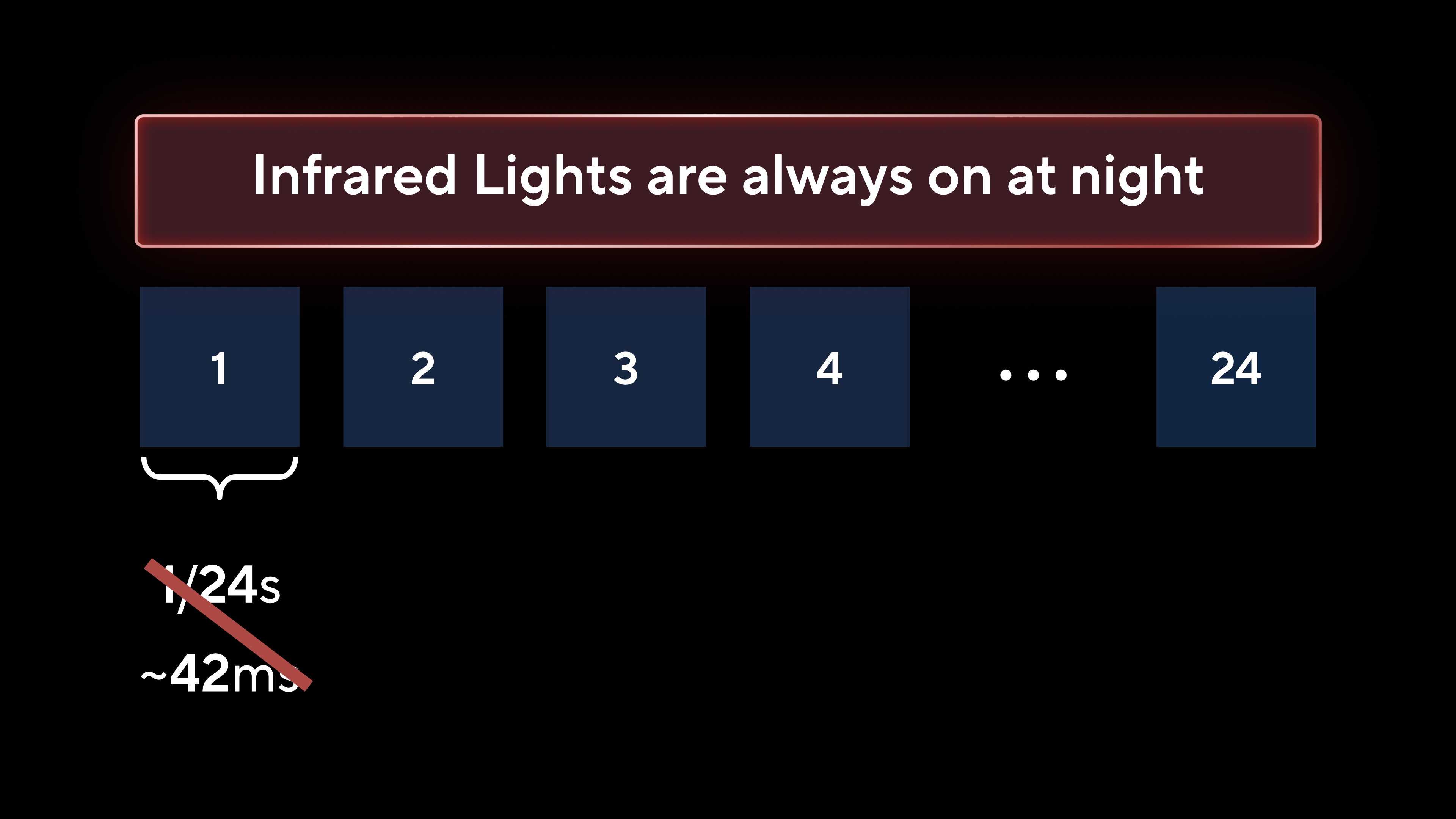
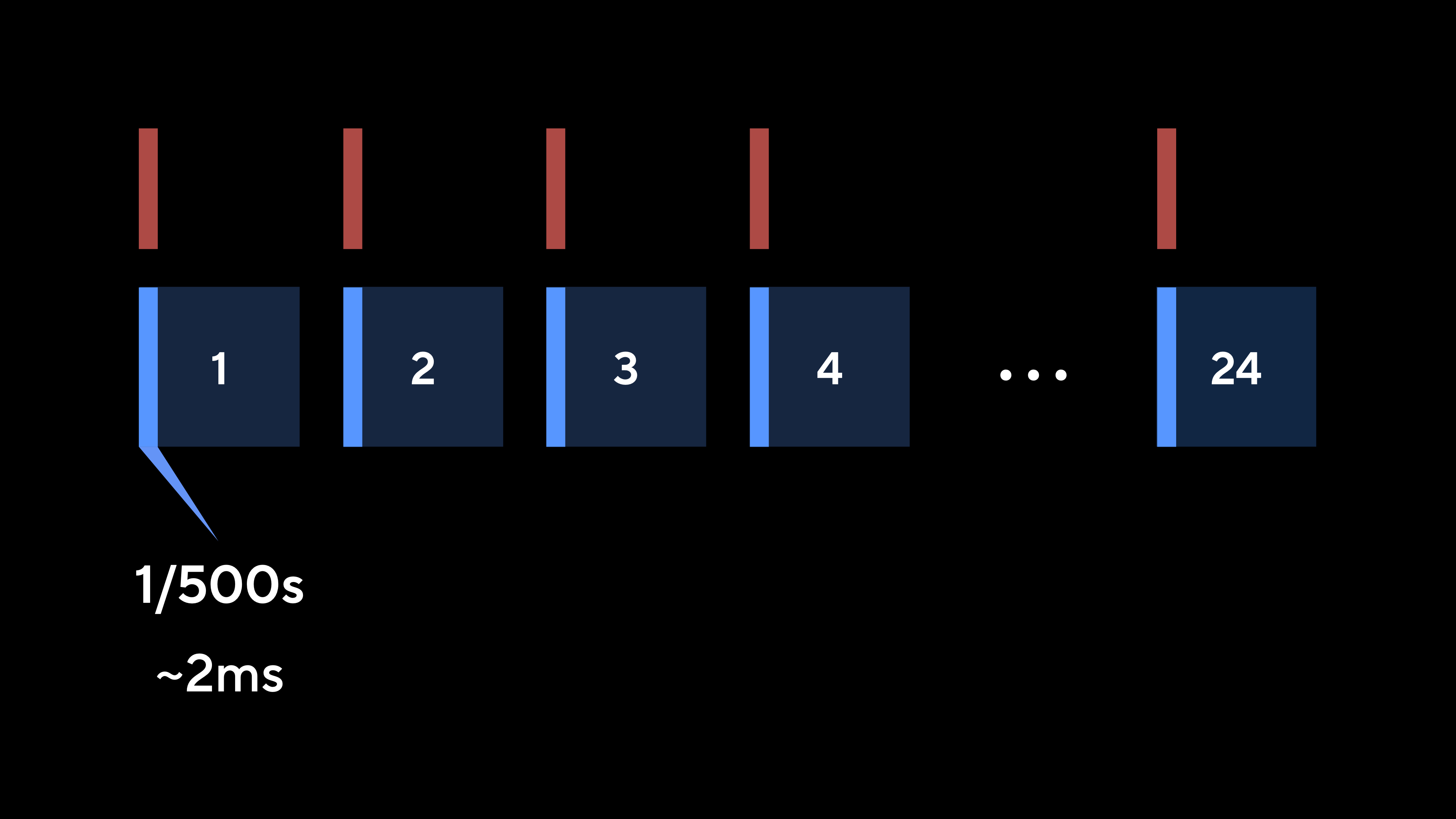
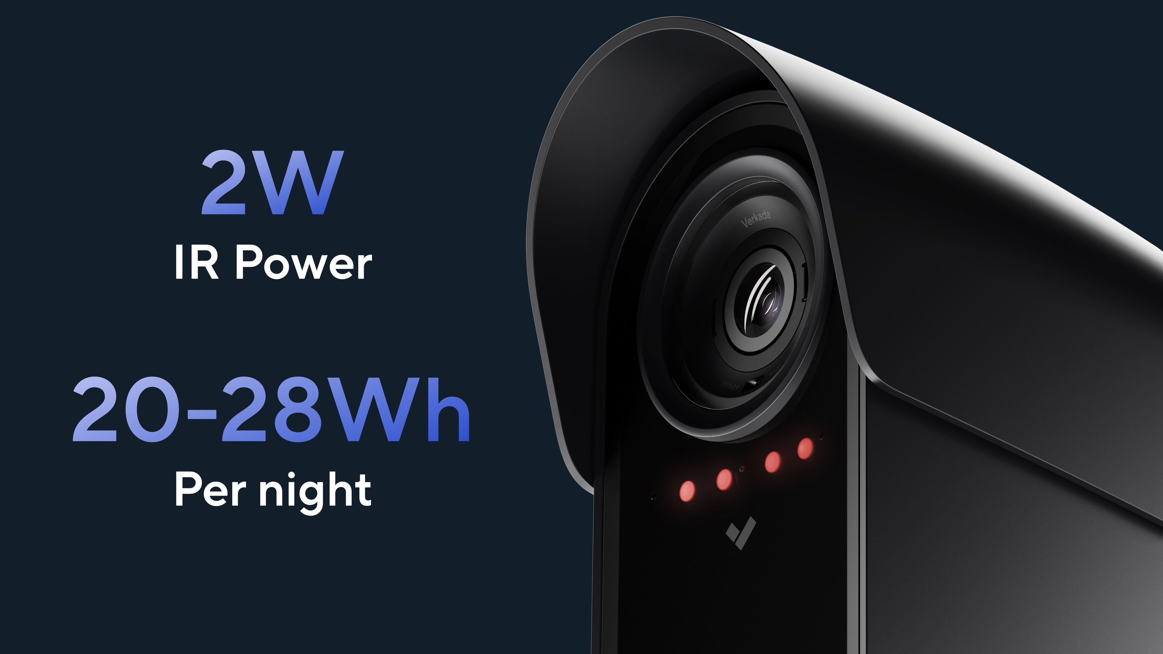
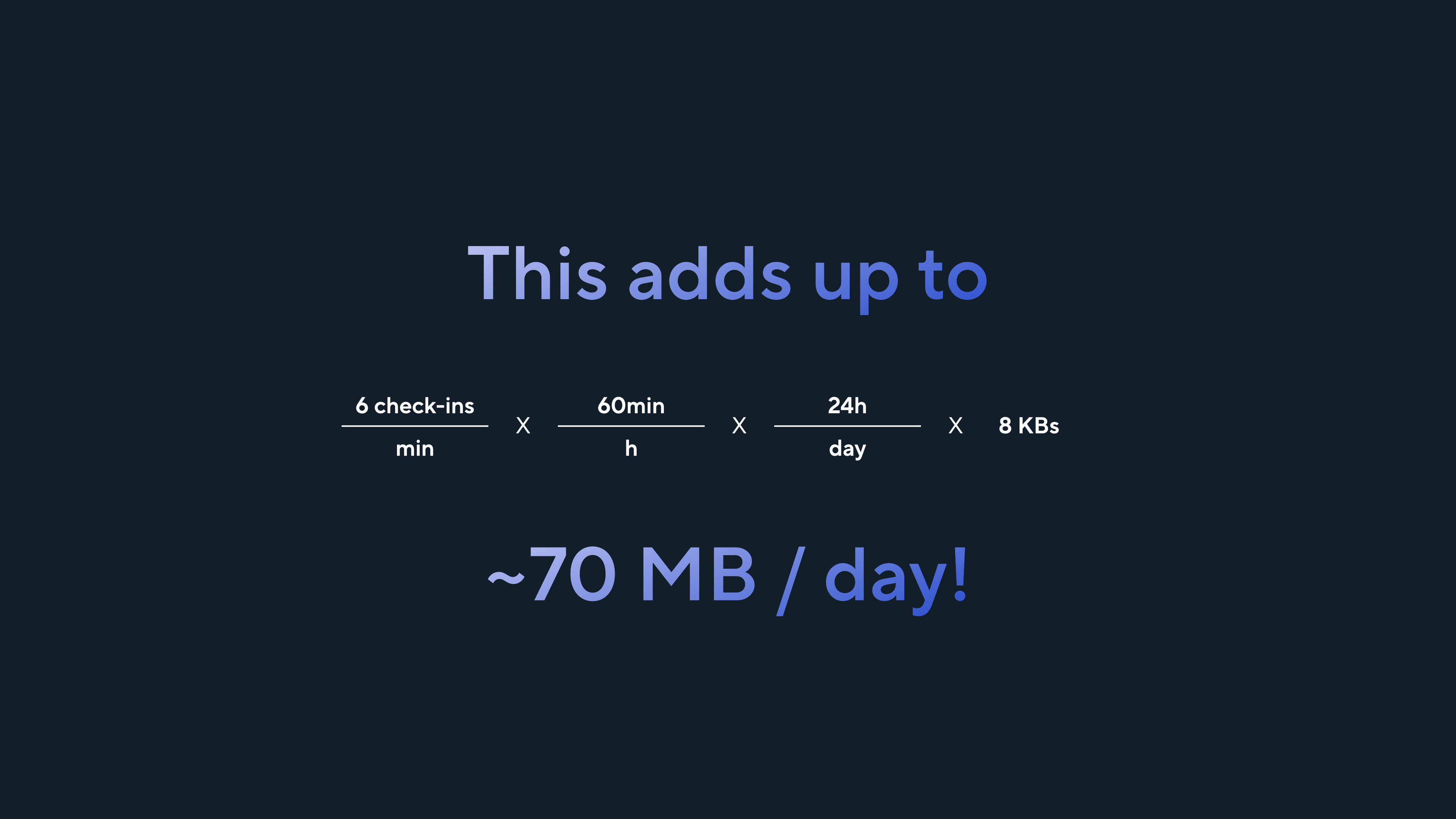
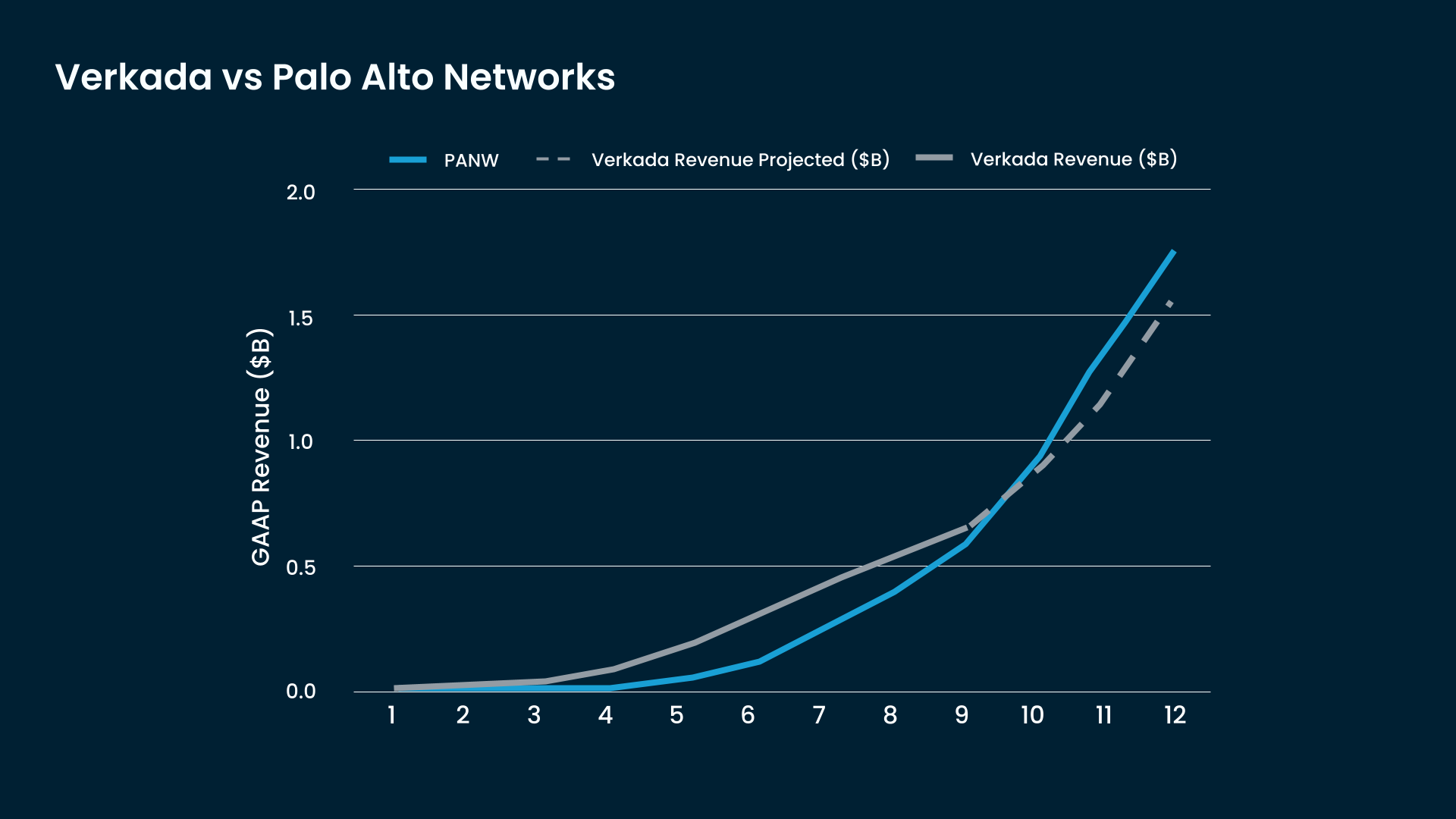
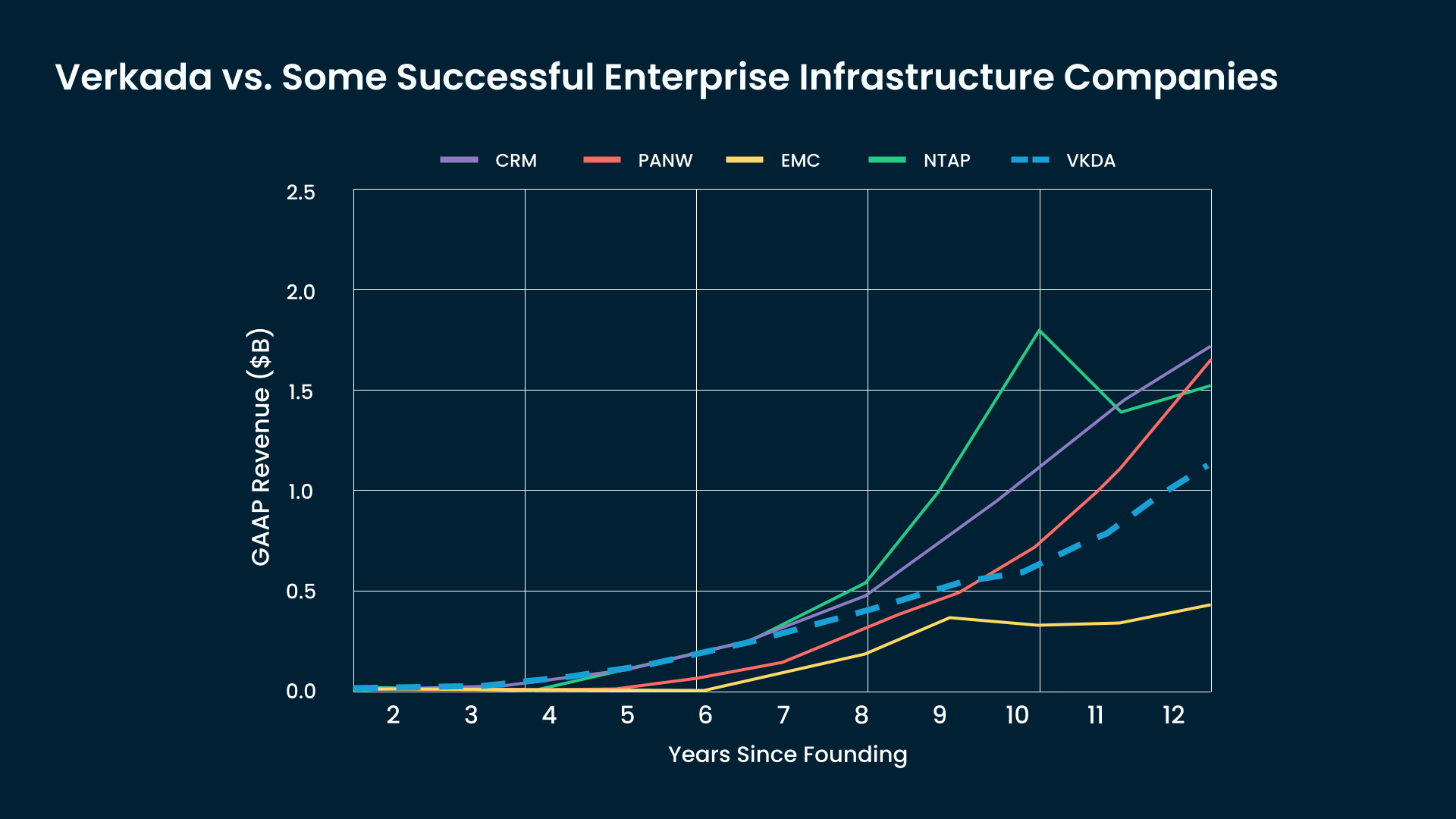
Chart Design
Reusable Chart Design
![]()
![]()
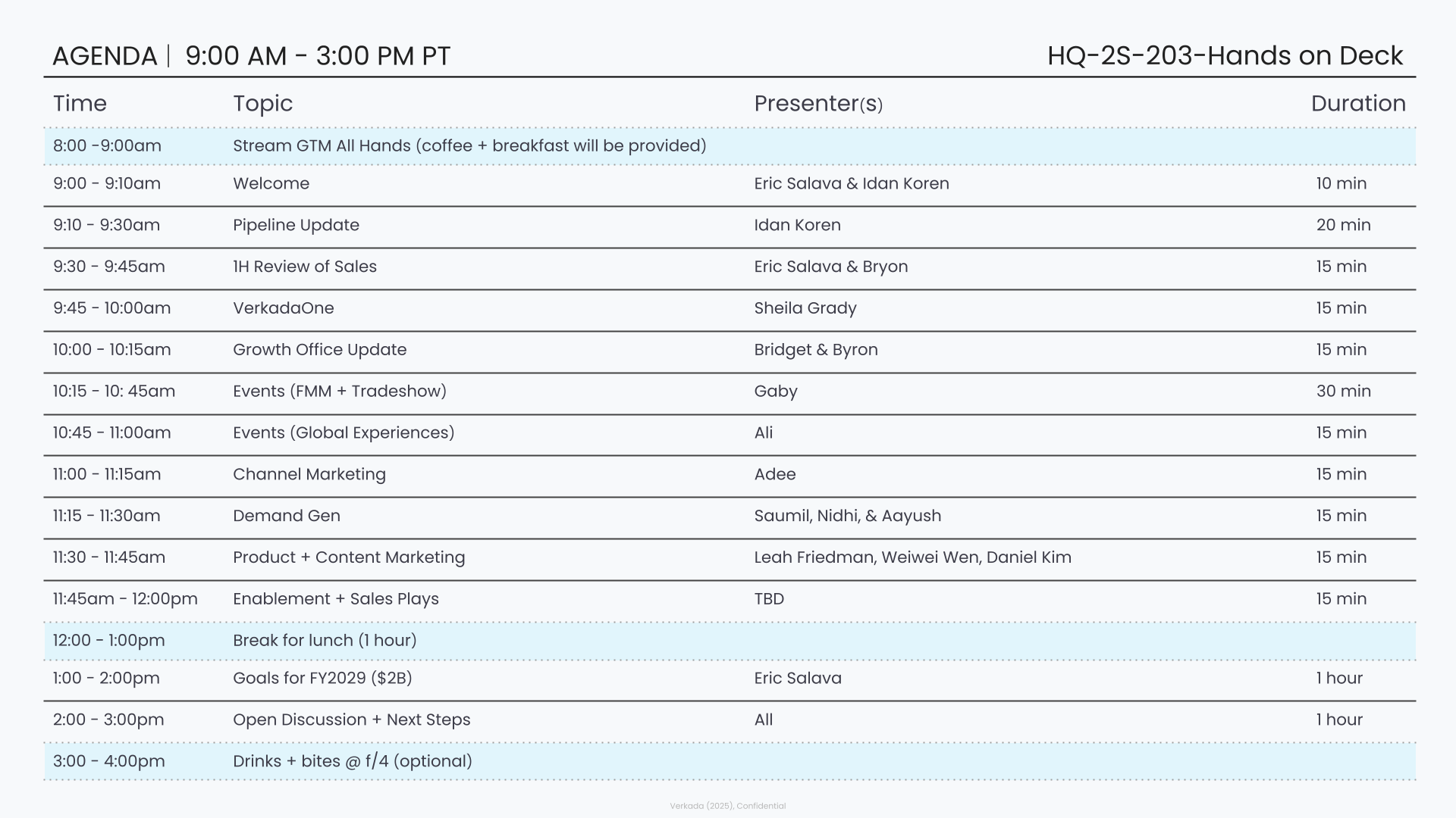
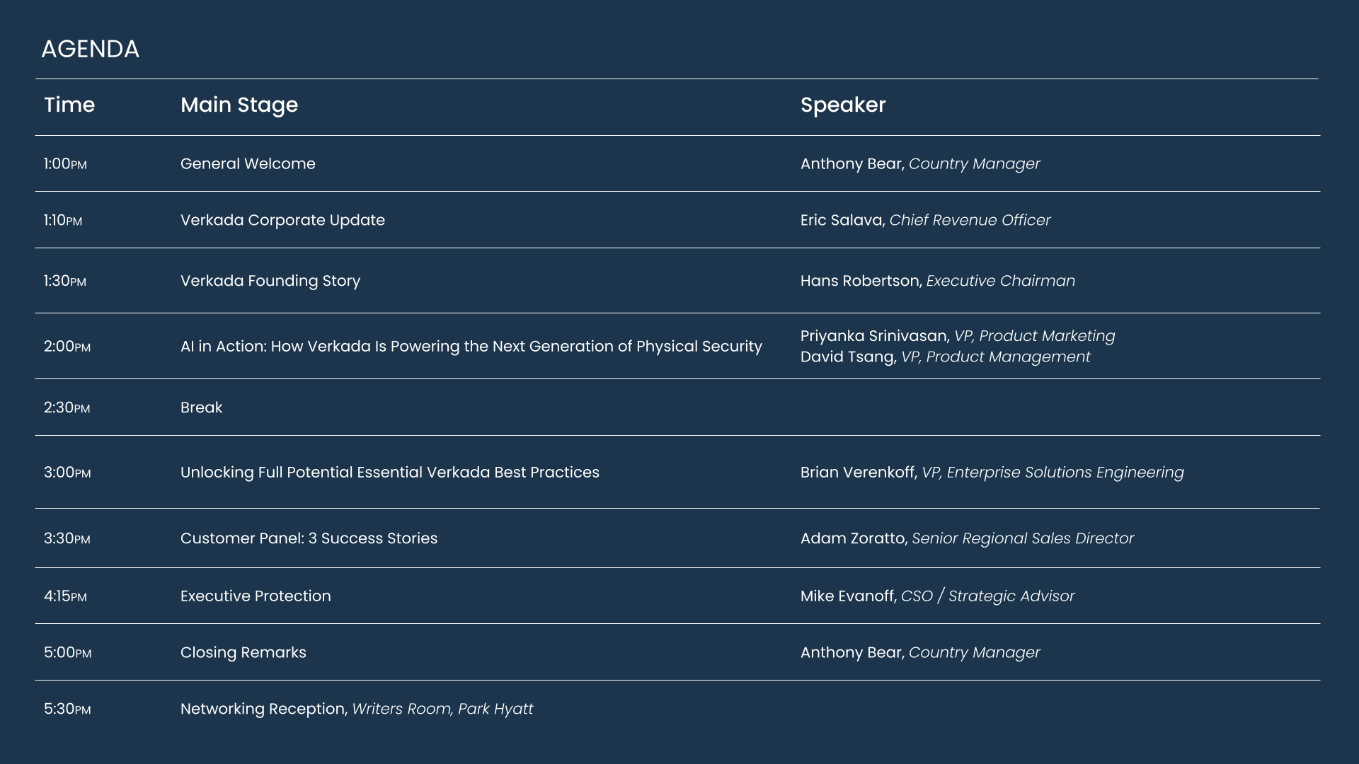
Agenda Design
Flexible Agenda Design
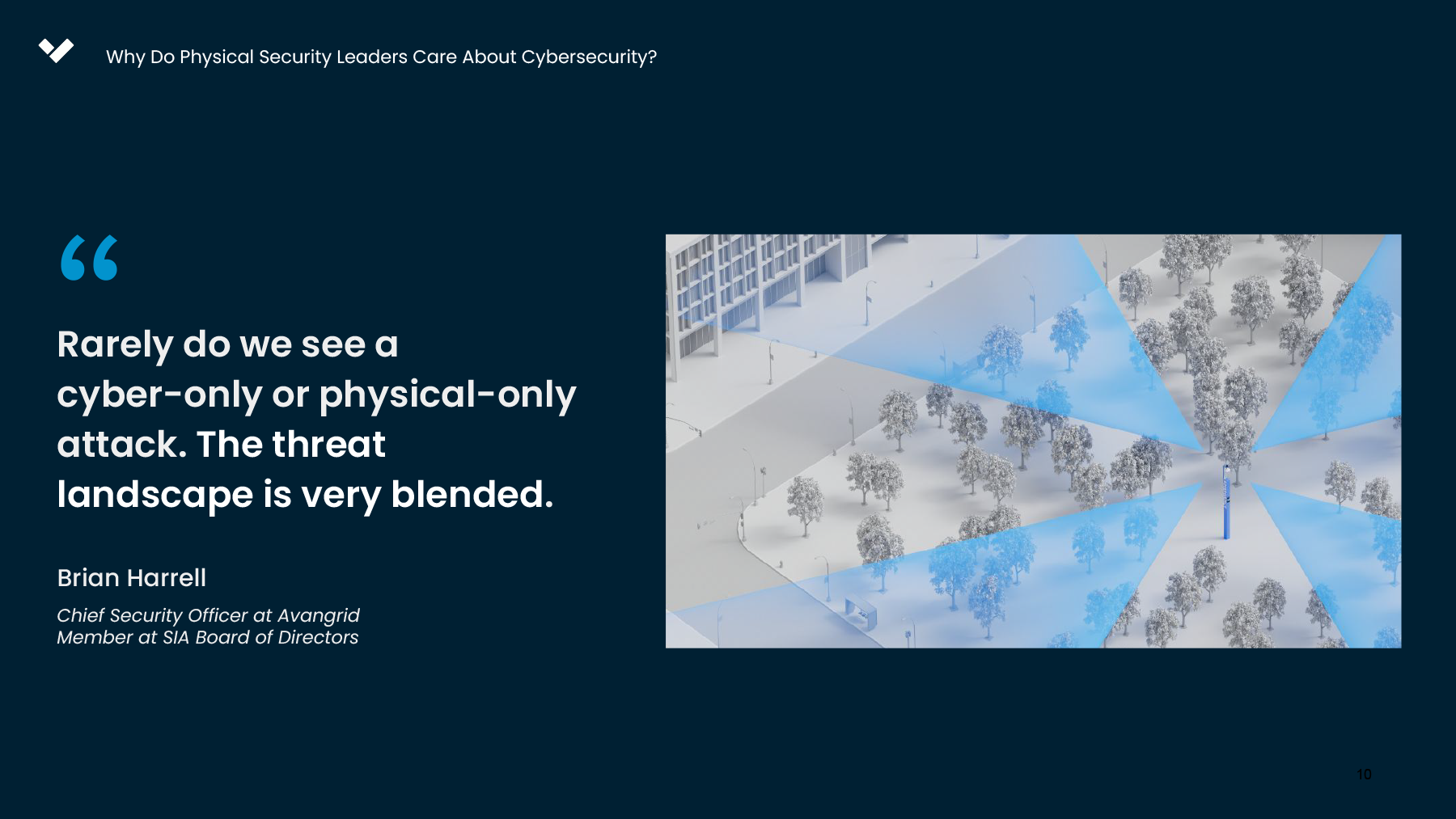
Webinar Design
Convergence of Cyber Security Webinar Design


Working on Verkada’s team inspires me to seek balance between visual clairty and creating uniquely surprising work.
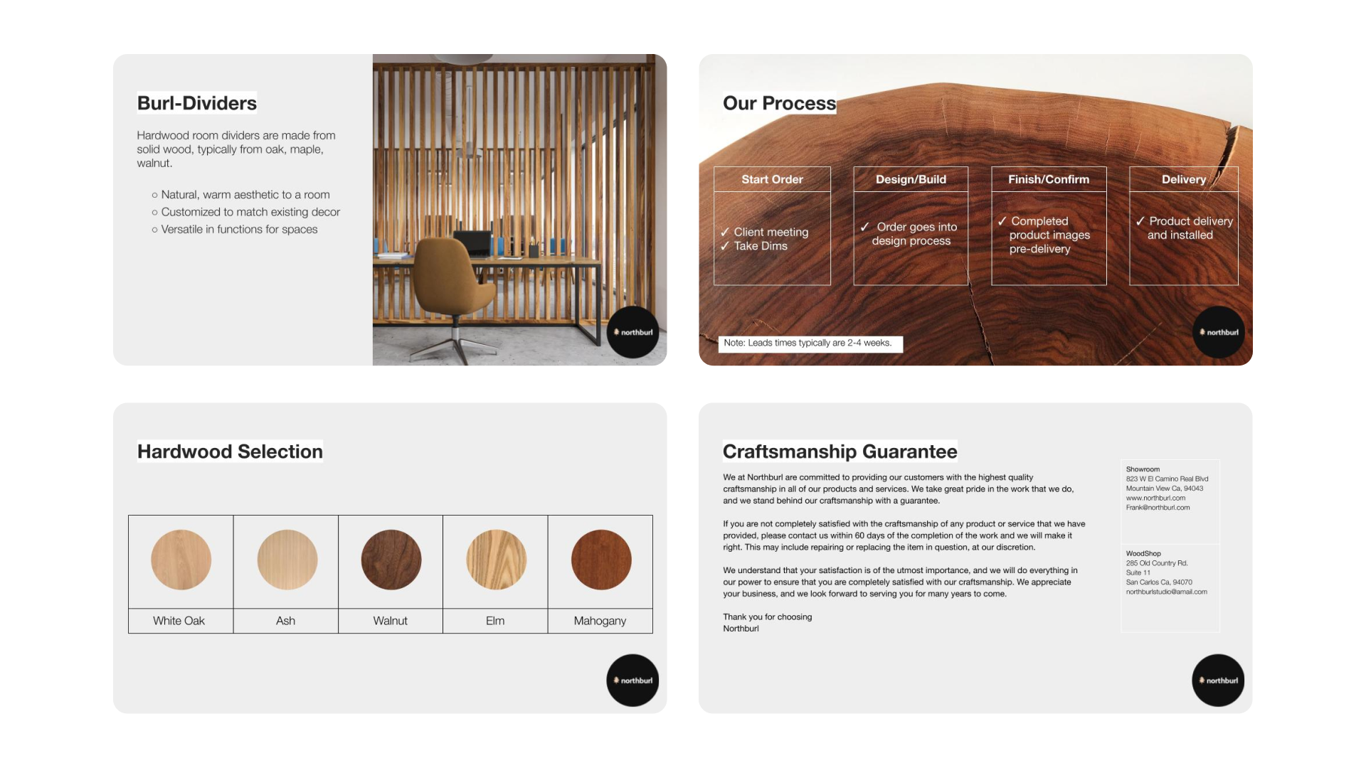
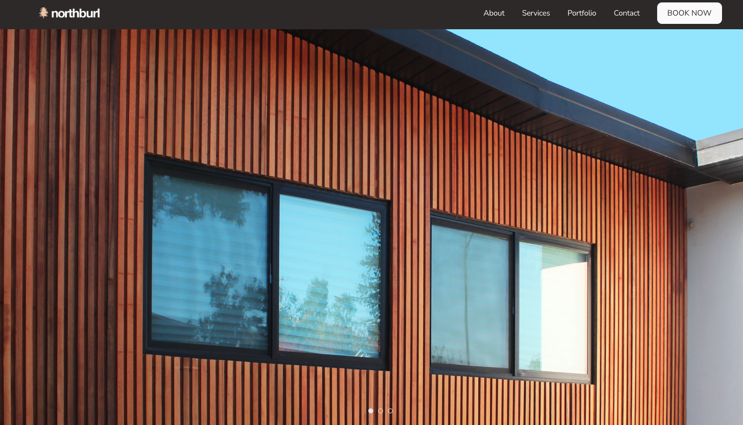
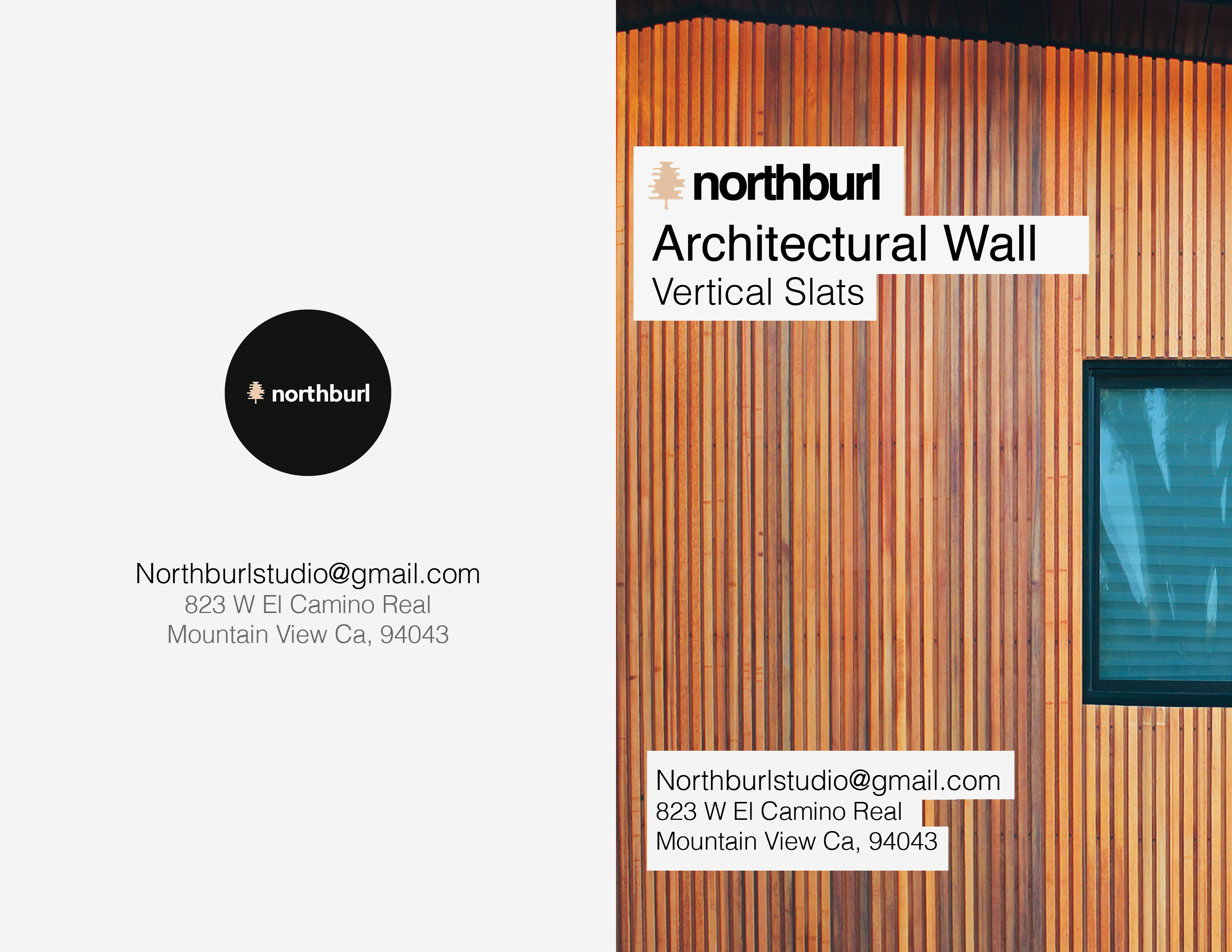
NorthBurl
As a Graphic Designer for NorthBurl, I expanded upon existing brand guidelines to create original visual content across photography, pitch decks, printed materials, and website assets, strengthening the overall brand identity and consistency across marketing campaigns.
Graphic Design Consultant
Marketing Manager
Brand Designer
Urna Bajracharya
Frank Zamuido
Anne Lee
Frank Zamuido
Anne Lee


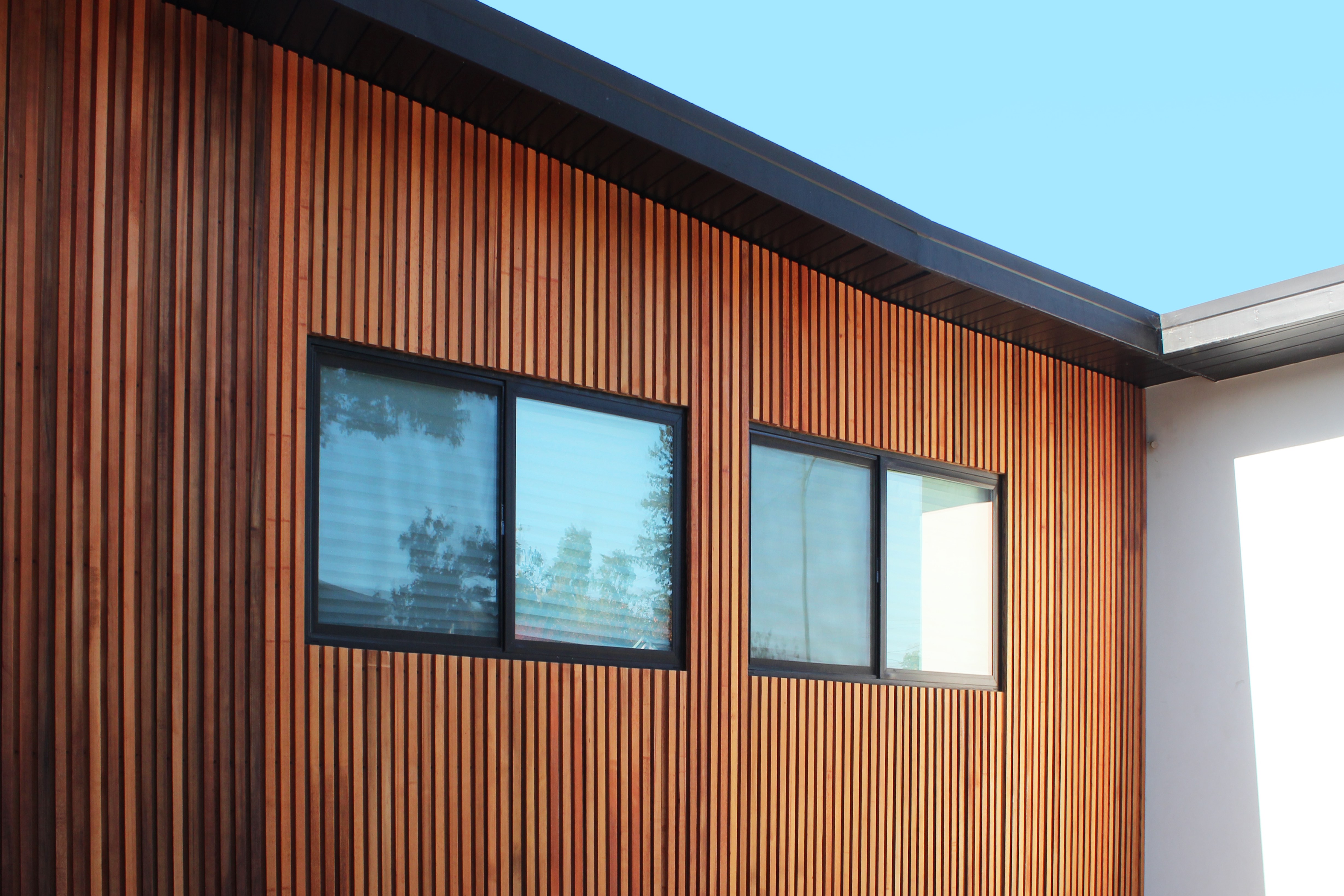
Product Visualization (Above)
I used Blender’s 3-D space and Photoshop’s precise material coloring to create a realistic product mock-up showcasing NorthBurl's capabilites, which helped drive up client engagement.

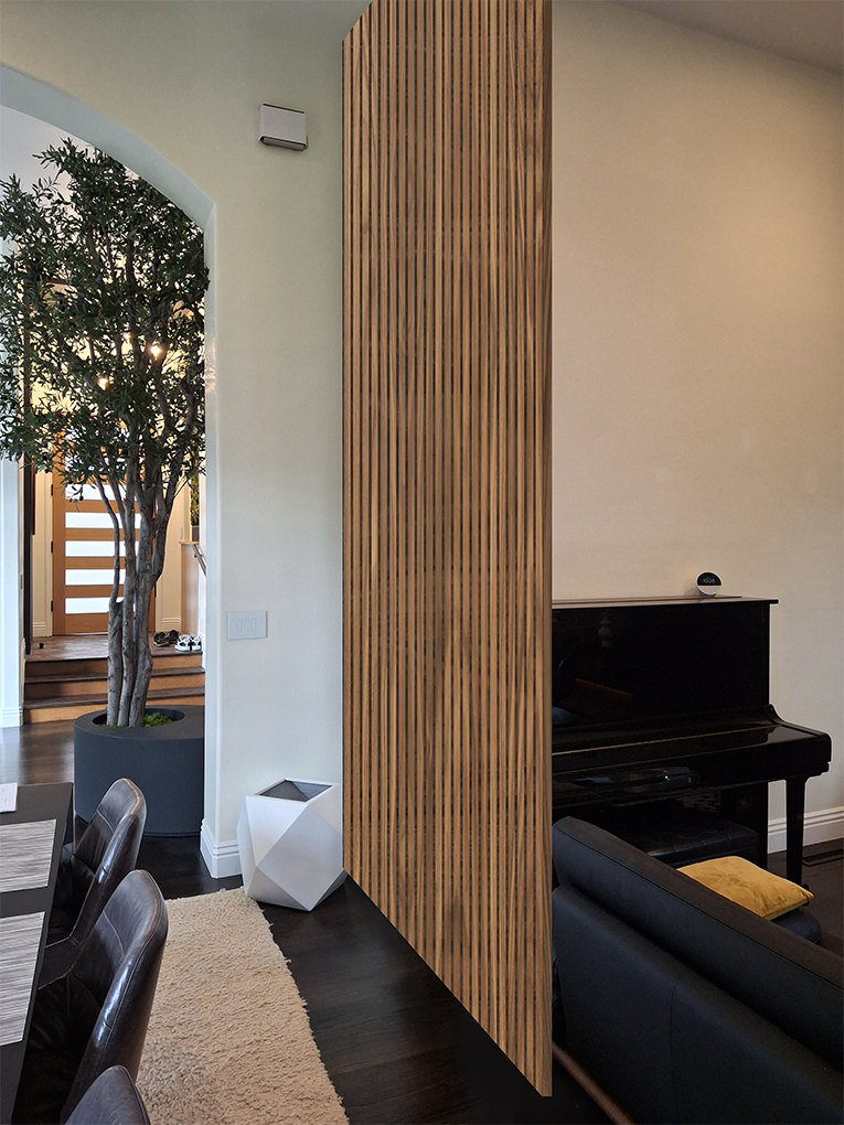
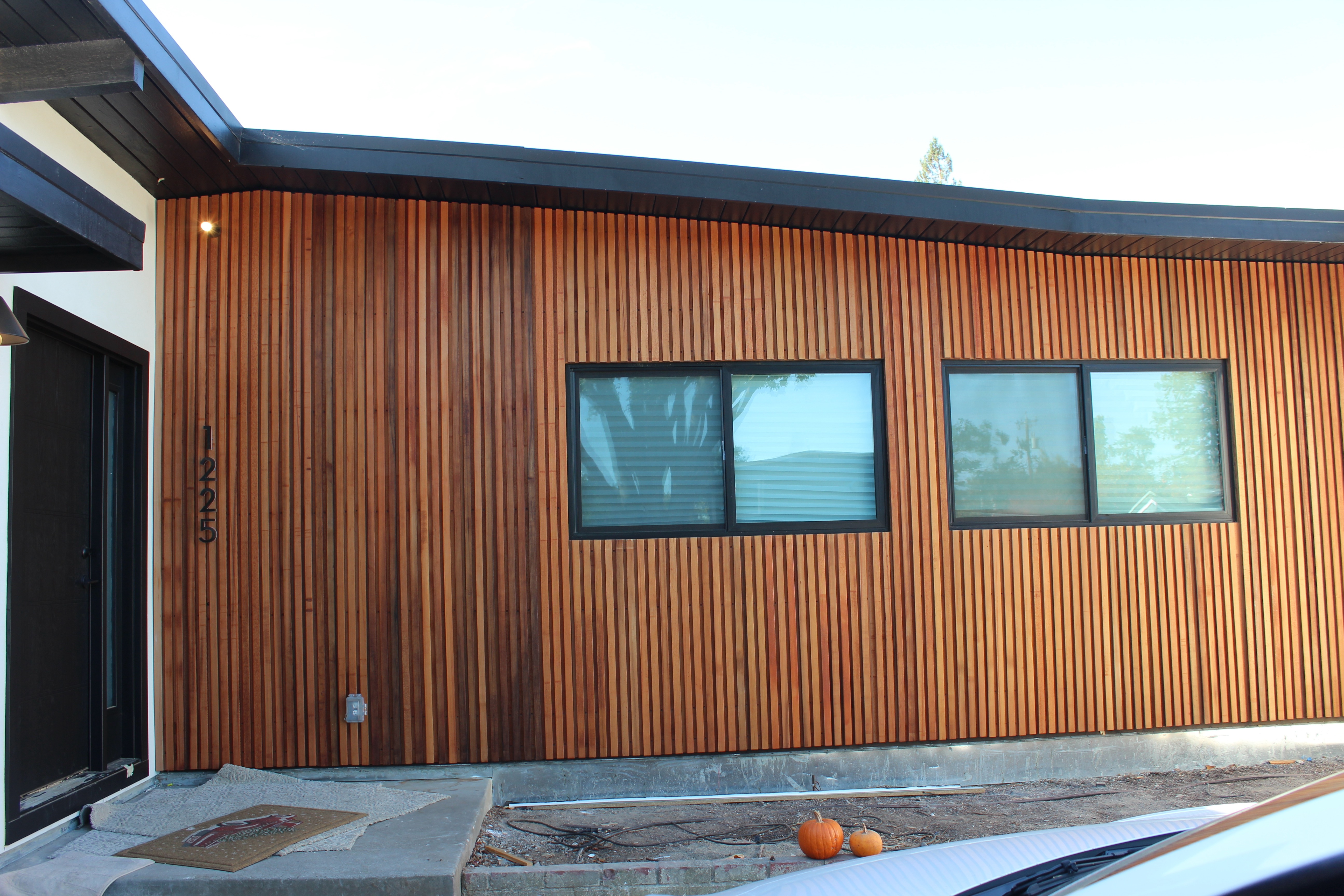
NorthBurl’s brand story is captured beautifully in the warmth and simplicity of its unique furniture designs.
Each piece tells its own narrative through the distinctive wood grains of tables and dividers.
It was a pleasure collaborating with NorthBurl and their clients.
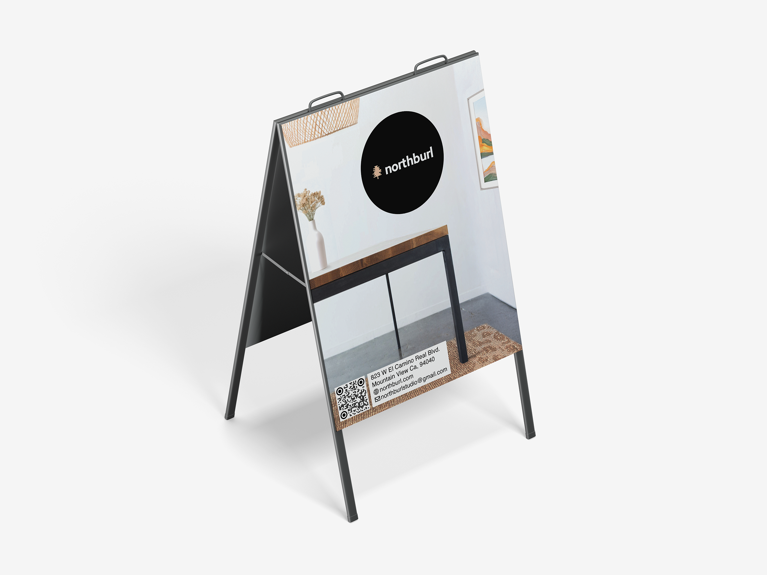
Deep Dive
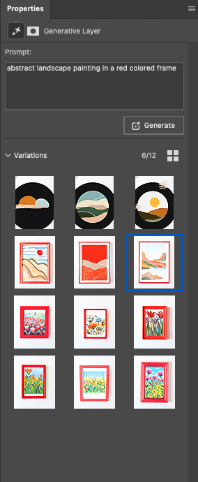
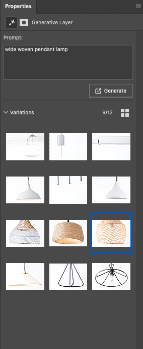
To prepare images for both digital and print, I used Adobe Photoshop, ensuring visual consistency and quality across various media. Hero images and exterior wall shots were personally photographed on-site, further enhancing authenticity and brand impact. Specifically, the A-frame poster (seen in the last image) required rapid turnaround; due to tight deadlines, approximately 90% of the visual assets were efficiently generated using Adobe Generative Fill, allowing for quick yet visually compelling results.
AI Generated Assets


AI Enhancement

As shot

Brand Alignment Editing


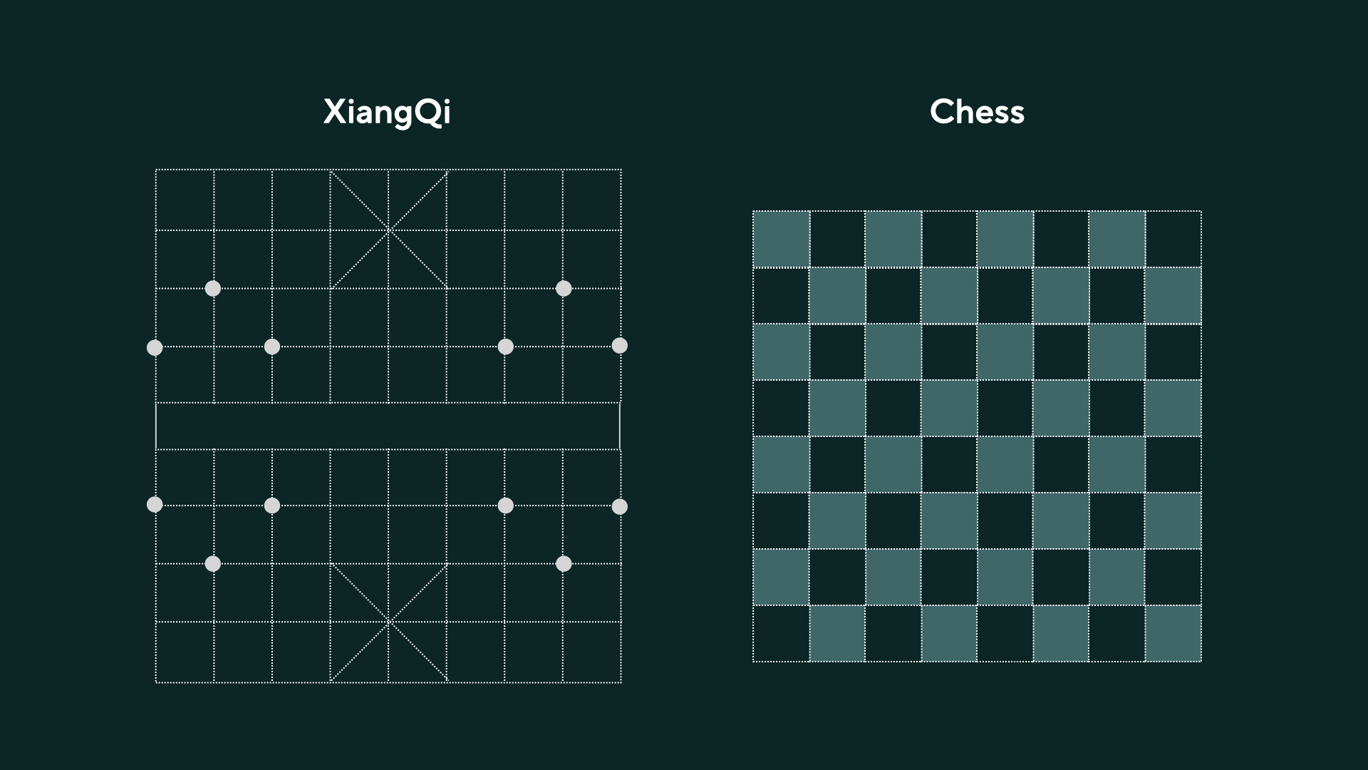
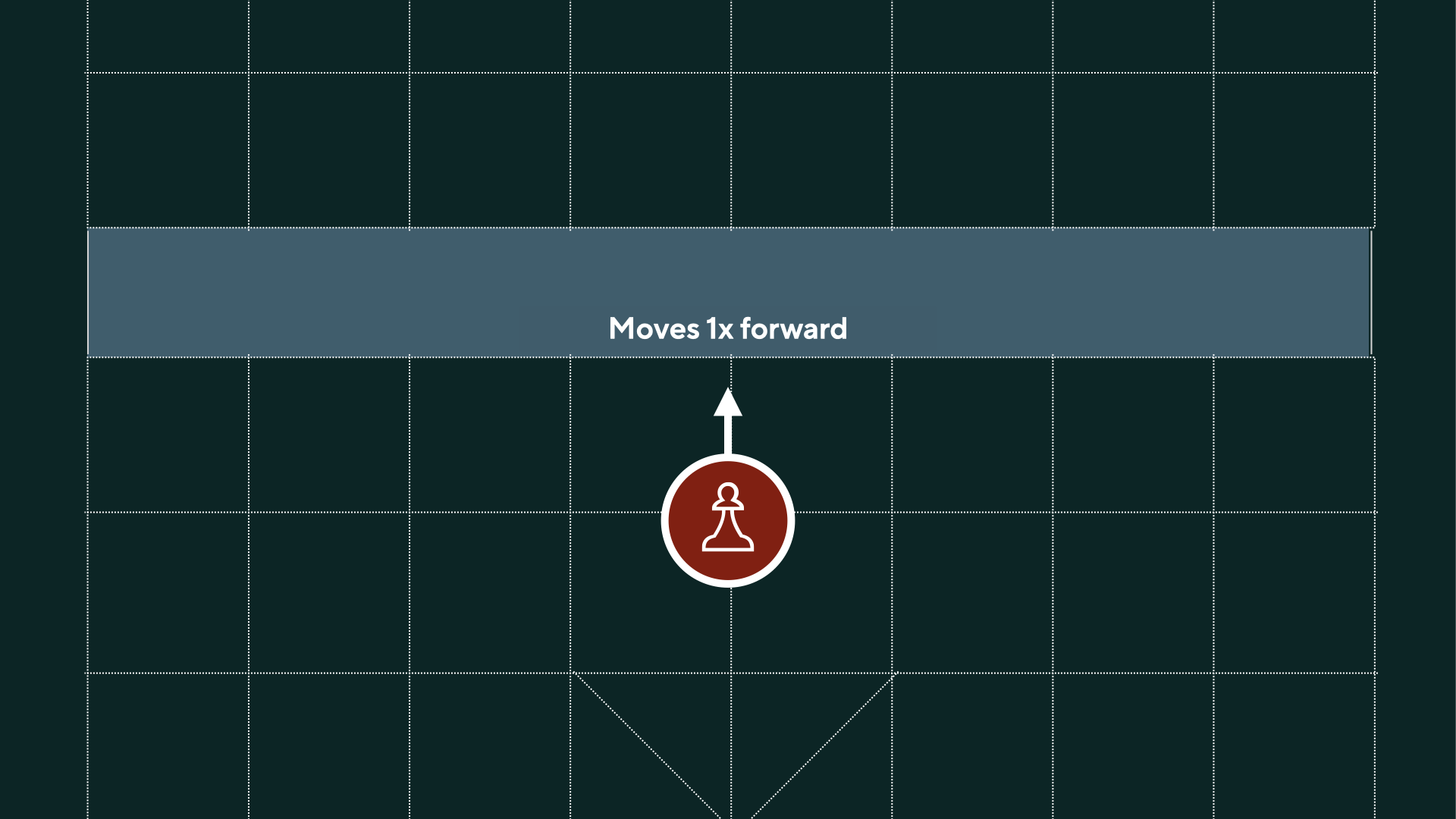
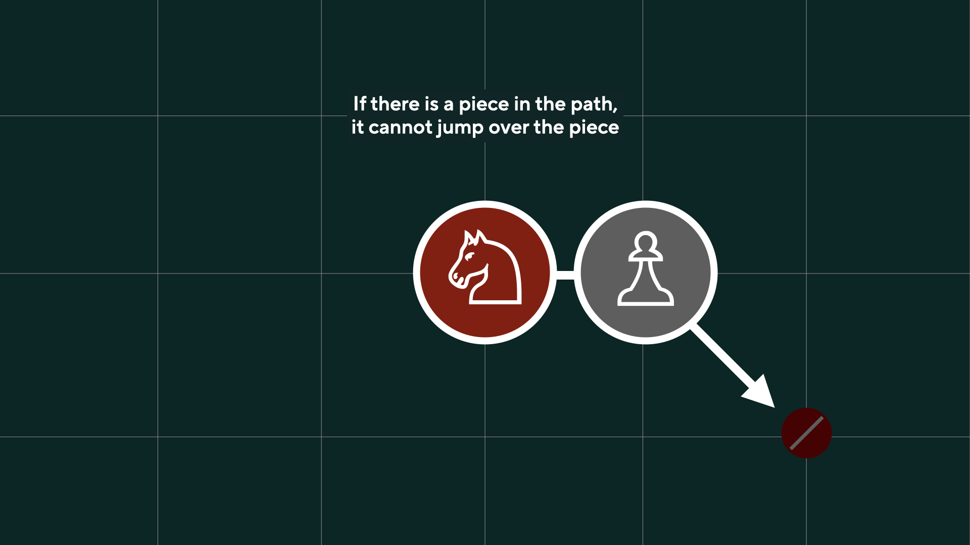
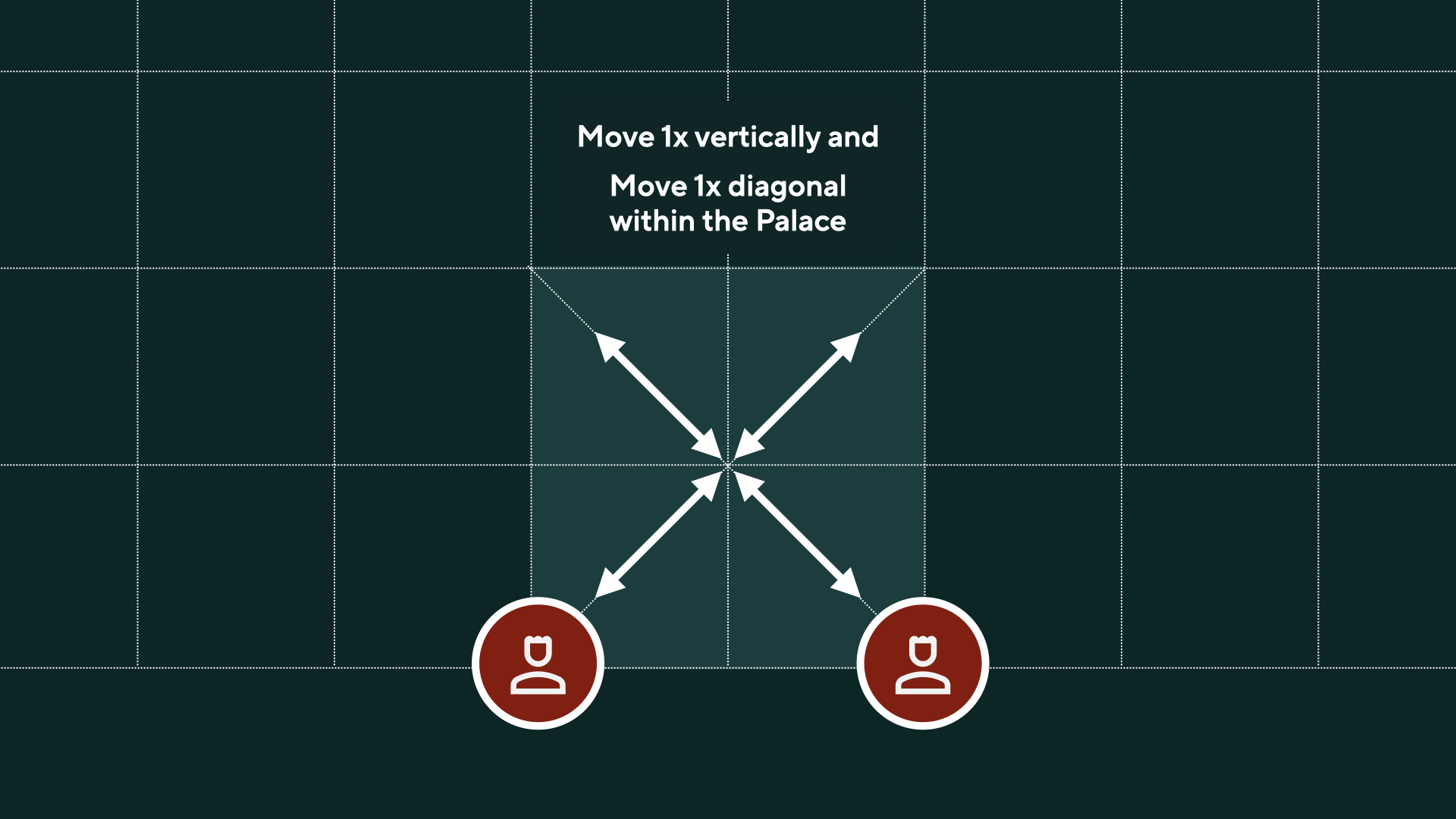
XiangQi
Aimed to create an educational and inutituve visual system, I elaborate on the not as well known chess played first in China, called XiangQi. I rely on simple visual directions to guide players to follow along and to connect the dots between the Chess that most of know and XiangQi.